Challenges

Challenges

Challenges

Challenges

Simply framing in Chase online experiences presented potential challenges.


Navigation

Web pages have their own unique way of going back or closing out, called the modal header. If framed in, this modal header would create redundancy with the native header. If a customer tapped the back arrow on the web modal header, they would navigate to web experiences instead of native.


Put simply, a customer could navigate the entire chase.com from within their native app.


Visual

Mobile web and native experiences used similar but slightly different design languages that risked a customer knowing they were viewing a webpage from within their native app. Mobile web pages also contained more information density and complexity than native pages.

Above—Using native header back navigation will take the customer back to their native menu. Upon tapping back again, it will guide the customer to their native dashboard.

Above—Using native header back navigation will take the customer back to their native menu. Upon tapping back again, it will guide the customer to their native dashboard.

Above—Using web modal header back navigation will take the customer back to a web view of Profile & settings. Upon tapping back again, it will guide the customer to their web dashboard. The native header is unaware that the customer has performed any navigation, showing "Profile & settings" incorrectly.

Above—Using web modal header back navigation will take the customer back to a web view of Profile & settings. Upon tapping back again, it will guide the customer to their web dashboard. The native header is unaware that the customer has performed any navigation, showing "Profile & settings" incorrectly.

Above—Using web modal header back navigation will take the customer back to a web view of Profile & settings. Upon tapping back again, it will guide the customer to their web dashboard.


The native header is unaware that the customer has performed any navigation, showing "Profile & settings" incorrectly.

Design language alignment

Design language alignment

Design language alignment

Design language alignment

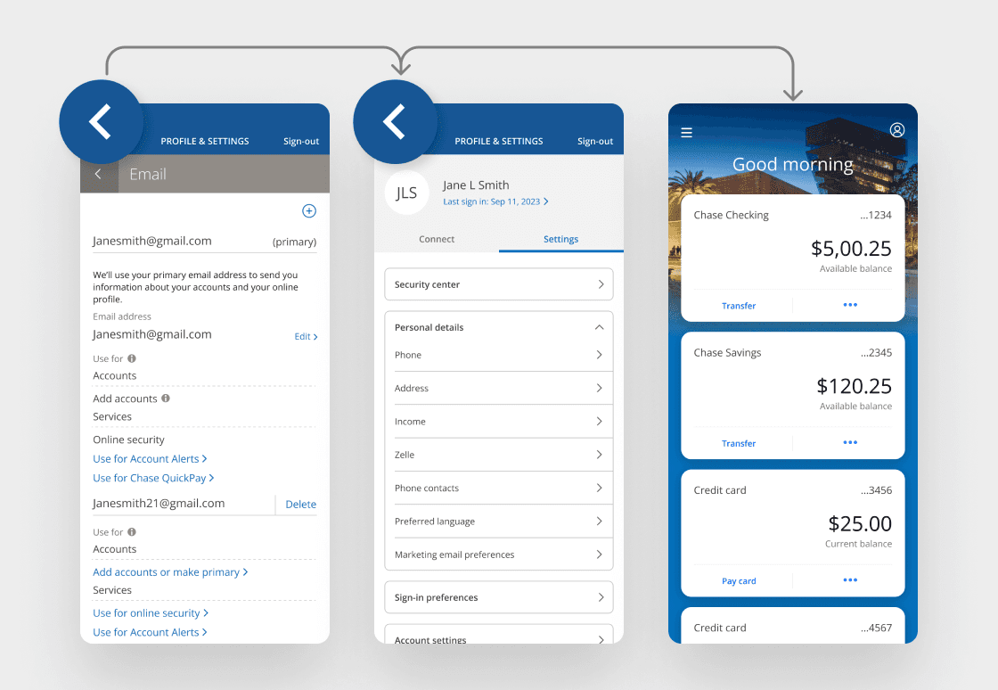
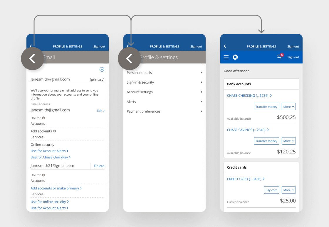
The Chase mobile web and Chase Mobile® app experiences had pattern differences that needed to be aligned. If web pages were to be framed into the mobile app, they needed to be in pattern parity in order for them to be indistinguishable from native pages.


To align the two systems, I performed a full audit of both design systems, and identified what elements in each system would need to be updated for hybrid solutioning to be affective.


Typography

Typography for mobile web experiences should follow the Chase Mobile app patterns.


Input fields

Input fields for mobile web experiences should follow the Chase Mobile app patterns.


Color palette

Colors should be visually consistent and compliant. All buttons on the Chase Mobile app should follow Chase Online patterns.

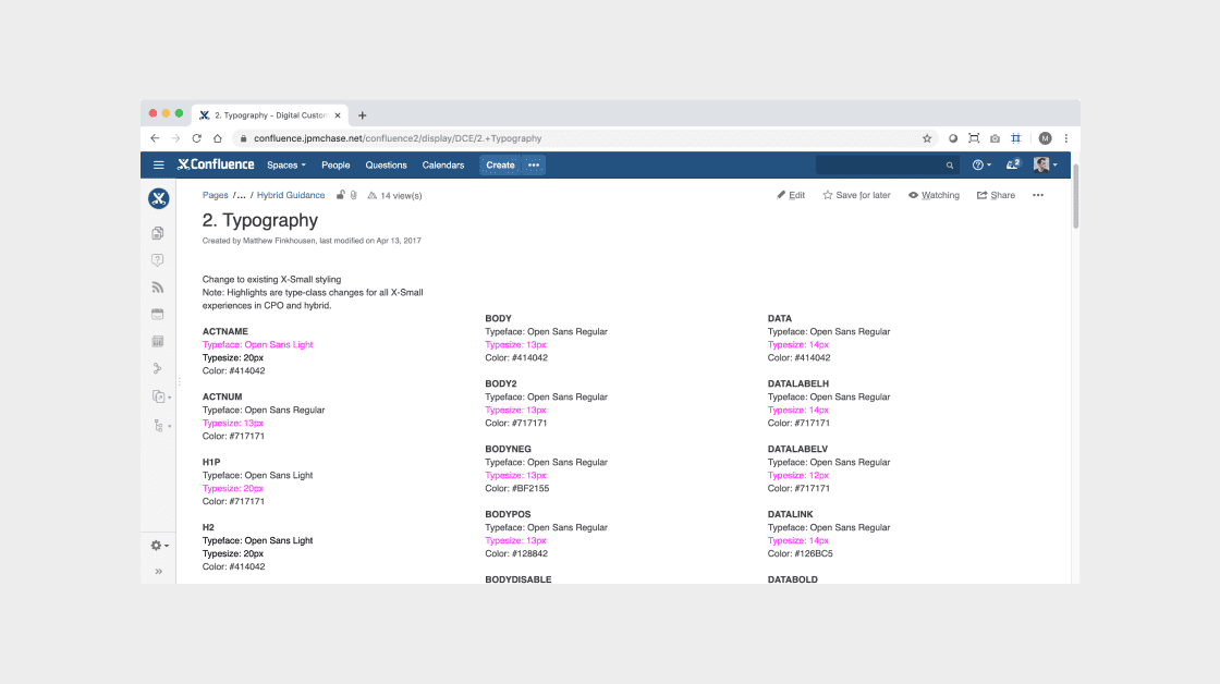
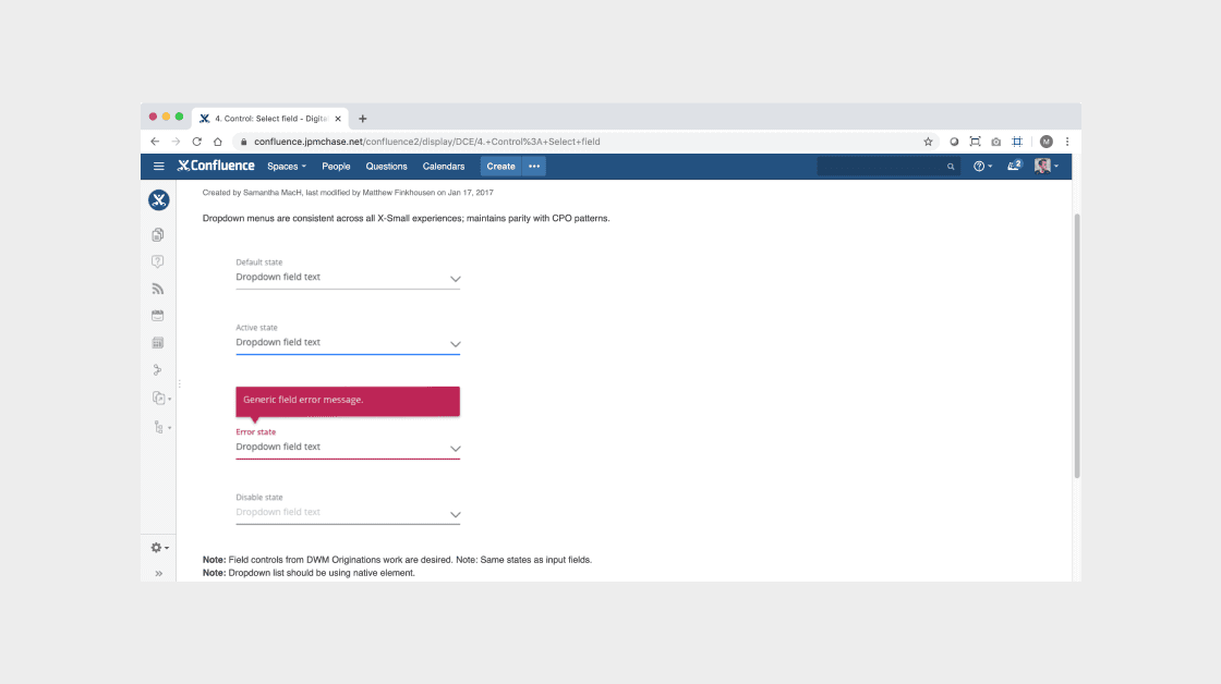
I created guideline documentation on Confluence to allow for easy access by all of Chase's digital product teams and stakeholders.

New Feature Playbook

New Feature Playbook

New Feature Playbook

New Feature Playbook

We defined three types of experiences and identifier characteristics to help us understand when experiences should be built in native, when they should be hybrid, and when web only experiences will suffice.


Hero product (fully native)

Examples – Send money, Zelle, Pay card, view and search transactions.


Core features (hybrid JavaScript + CSS)

Examples – Edit email address, change phone number, update password, view credit score, FAQs.


Long-tail experiences (fully web)

Examples – Terms and conditions, mvp experiments, temporary partnership promotions

We recognized that framing in existing web pages had the potential to significantly degrade the overall native experience if not done well. In order to ensure all teams delivered at or above the high quality bar already set by Chase’s existing native app we established and committed to the following strategic framework.


Unified

Designs for hybrid pages should be visually consistent with Chase Mobile® app pages.


Usable

When in the native app, customers shouldn’t be able to tell they are viewing a framed-in web page.


Simple

All experiences within the Chase Mobile app should be simple, with no unnecessary complexity.


Fast

Performance should be on par with a native experience.

New Feature Playbook

We defined three types of experiences and identifier characteristics to help us understand when experiences should be built in native, when they should be hybrid, and when web only experiences will suffice.

Native builds for

Hero products

Native builds for Hero products

Examples – Send money, Zelle, Pay card, view and search transactions.

Hybrid builds for

Core features

Hybrid builds for Core features

Examples – Edit email address, change phone number, update password, view credit score, FAQs.

Web builds for

Long-tail experiences

Web builds for long-tail experiences

Examples – Terms and conditions, mvp experiments, temporary partnership promotions

New Feature Playbook

New Feature Playbook

New Feature Playbook

New Feature Playbook

We defined three types of experiences and identifier characteristics to help us understand when experiences should be built in native, when they should be hybrid, and when web only experiences will suffice.

We defined three types of experiences and identifier characteristics to help us understand when experiences should be built in native, when they should be hybrid, and when web only experiences will suffice.

We defined three types of experiences and identifier characteristics to help us understand when experiences should be built in native, when they should be hybrid, and when web only experiences will suffice.