
At JPMorgan Chase, I led the creation of a streamlined approach to design, enabling rapid development for the Chase Mobile app, enhancing mobile web experiences, and reducing maintenance down to a single source of code.
Design strategy
UX
UI
UXR
Rapidly build and deploy features missing on the Chase Mobile app
JD Power published its first mobile banking report, highlighting that although the Chase Mobile app was the world's highest-rated banking app, it had essential feature gaps other banks had closed and that Chase customers saw as baseline. The report highlighted features that were already available online, but not available on the Chase Mobile app.
Remove bottleneck
Because the Chase Mobile team had a full book of work of key experiences, there was no way to integrate designing and developing these features into their current roadmap.
Eliminate feature gap between web and native experiences.
Leverage existing web experiences to accelerate development.
Evaluate the potential of establishing a system to permanently alleviate mobile as a bottleneck.
Maintain the exceptional user experience Chase customers cherish and anticipate.
Chase experiences required both native and web builds
This was costly to build and maintain, and required product owners to decide if they wanted to build experiences for both web and native, or to choose a single platform to deploy to.
Lightbulb moment
If we could discover a strategy to reduce the feature gap and maintain consistency across the platforms, any future experiences could be developed on web and deployed within the native app, drastically reducing project scope and costs.
Drawing from previous audit experiences
I had led design across the native and web platforms, and knew there were significant differences between the two that we would have to reconcile and elevate. These differences meant it wouldn't be as simple as framing web pages within the native app.
To create a map of what was happening across both platforms that painted a picture of our UX and engineering opportunities, I completed a deep, thorough audit of the platforms that examined navigation patterns, competing architectures, and level of content details they provided.
I uncovered platform differences in components, typography, and color palettes.
Components
Color and typography differed between a variety of components across the two platforms.
Typographic
Typography within the native app was not visually aligned to their web counterparts, and not AA compliant. Chase strictly adheres to AA standards as required by federal regulation.
Color palette
Color palettes were not aligned across the two platforms, evident on components, links, and body content.
I uncovered significant navigational differences between web and native platforms. I brought these findings to design and engineering leadership in order to identify potential solutions that create a unified method of navigation and result in a customer being unaware they were navigating between web and native pages on the Chase Mobile app.
Chase Mobile app navigation
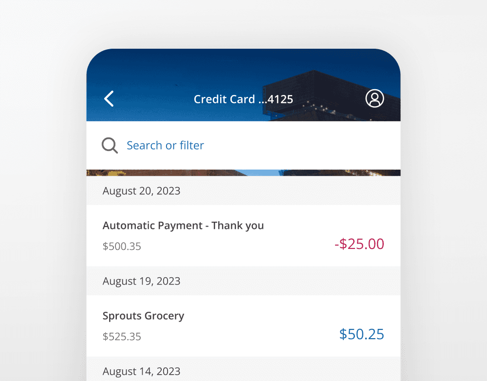
Screen title
Screen titles are displayed on the native header.
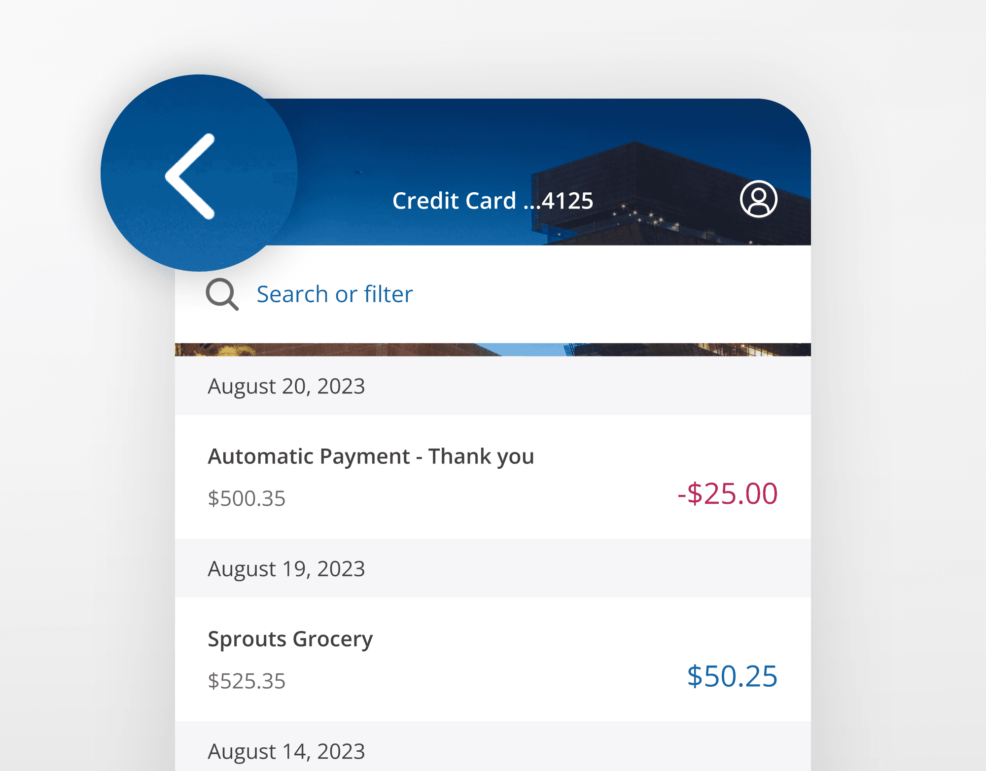
Back navigation
Interacting with the Chase Mobile app back arrow will return the customer to the previous screen.
Forward navigation
Interacting with a primary button/skip/link will take the customer forward a single screen.
Ending a flow
Interacting with a Cancel/Done button will take the customer back to where they began their workflow.
Screen title
Screen titles are displayed on a web inline modal header.
Inline modal header back navigation
Interacting with the web inline model header back arrow will return the customer to where they began their flow.
Browser back navigation
Interacting with the browser back will navigate the customer back to the previous screen.
Forward navigation
Interacting with a primary button/skip/link will take the customer forward a single screen.
Ending a flow
Interacting with a Cancel/Done button will take the customer back to where they began their workflow, the same as inline modal header back navigation.
Editing
Interacting with an edit button opens an accordion.
Content differed across the native and web platforms due to the web experience containing the robust, full-functionality of what Chase offers. The Chase web experience is designed to be used primarily on desktop, containing full content details and complexity.
In contrast, The mobile app is an on-the-go companion, with bite-sized tasks, simplified functionality, and less content density and details.
I crafted principles and definitions to establish a strategic solution that would enable Chase to frame any webpage within the native app, and for it to be indistinguishable from a native page visually and from an interaction standpoint.
Unified
Customers should not be able to tell that they’ve left a native environment.
Simple
Areas with a lot of functional complexity that don’t make sense to mobile users should be suppressed when possible.
Fast
Performance should be on-par with a native experience.
Hero (fully native)
Chase defining experiences, such as Send money, Zelle, Pay card, view and search transactions.
Core (native +css)
Expected experiences, such as Edit email address, change phone number, update password, view credit score, FAQs.
Long-tail (css)
Non-core experiences such as terms and conditions, MVP experiments, temporary partnership promotions.
To ensure a seamless integration of web pages into the Chase Mobile® app, I documented the pattern differences between the two systems, providing recommendations that would achieve pattern parity and make web and native pages indistinguishable.
I was able to quickly update and deploy the missing features that were highlighted in the original JD Power report, with no visual or interaction differences between natively built web pages, and the framed ‘hybrid’ pages.
Chase lines-of-business can now decide on the products or features they want to deploy, build once, deploy on both platforms, and maintain a single-source of code. It opens new experimentation opportunities via Chase Mobile app, and significantly reduces budgeting of resourcing the native mobile design team.
Learn more about the process, how we deployed, provided guidance, reduced feature gap, and exceeded business goals multiple times over.