Hybrid Design Strategy
JPMorgan Chase
Introducing a groundbreaking approach to digital service design, enabling rapid development for the native app, all while enhancing user experiences.
Role
Design Lead for Strategy, UX, UI
The situation
Problems made public
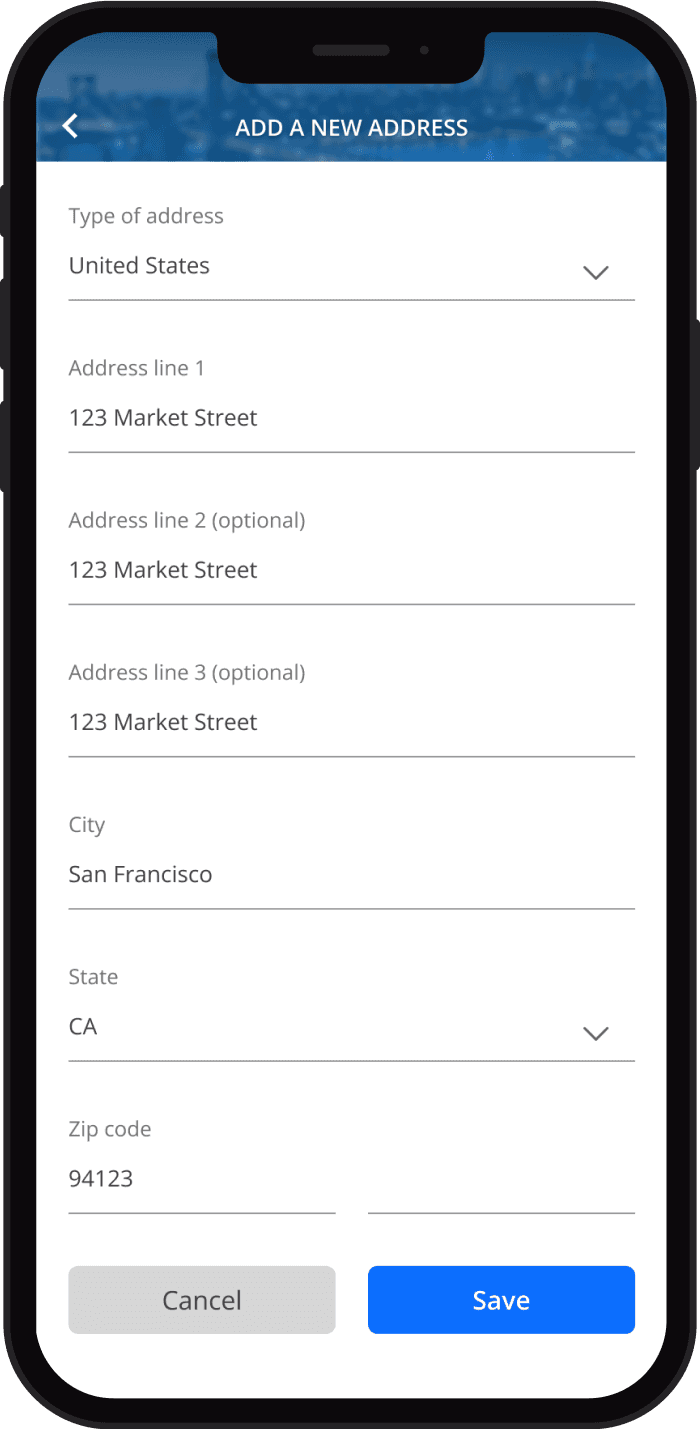
Upon the release of the inaugural J.D. Power Banking App Satisfaction report, it became evident that Chase, despite having the world's top-rated banking app, still had essential feature gaps. Notably, the inability to change one's email address stood out.
In response to this revelation, the leadership team swiftly engaged with the mobile team to determine the timeline for achieving feature parity. These gaps posed a growing risk of eroding the trust and business of Chase's most valued customers.
Bandwidth limitations
It became evident that the Chase Mobile® app team, although highly capable, was operating at full capacity and had become a persistent bottleneck for any additional requests outside the existing roadmap within Chase's app ecosystem.
Solutions with staying power
As a lead on the team, my mission had two core objectives:
To unblock teams and business lines, enabling them to swiftly launch these essential capabilities.
To establish a system that would permanently alleviate the bottleneck, all while upholding the exceptional user experience our customers had come to cherish and anticipate.
How might we...

Challenges
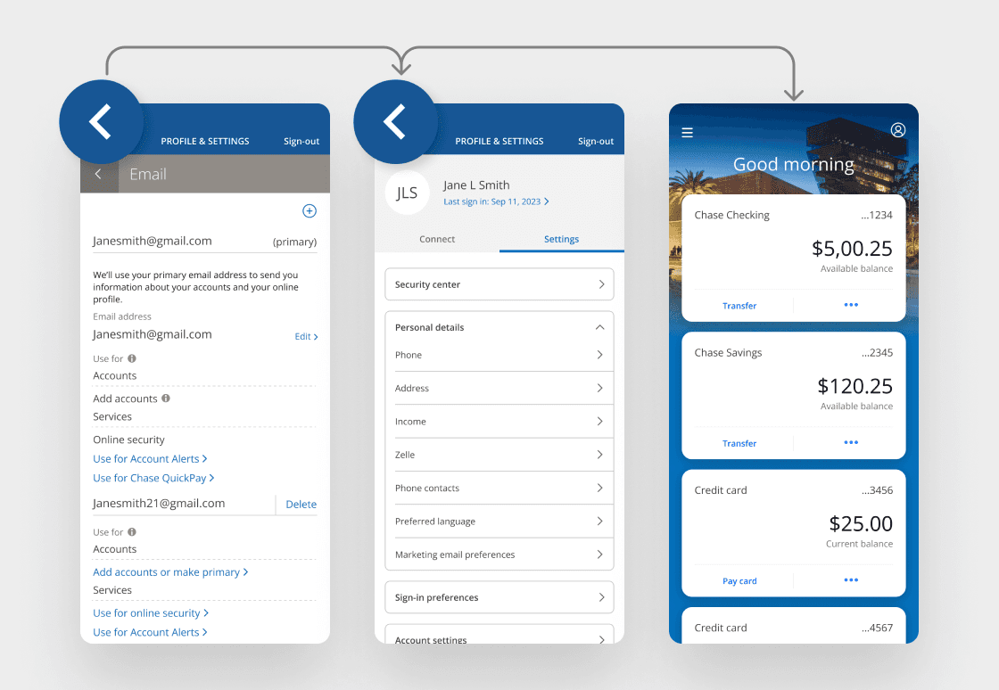
Navigation
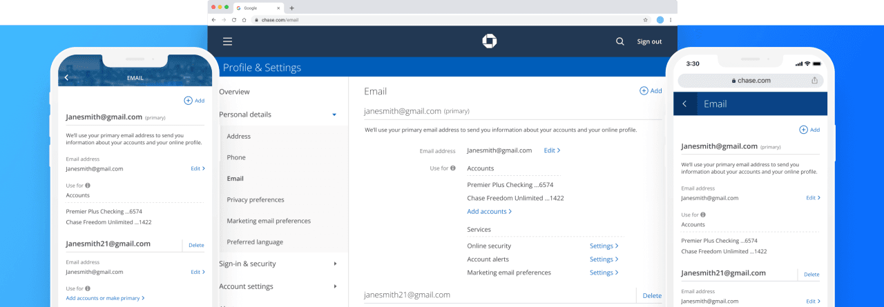
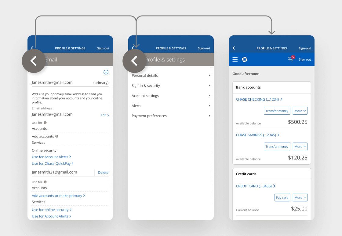
Framed Chase online experiences presented potential challenges. Specifically, web pages had a unique method of going back or closing out, known as the modal header. Framing this modal header would lead to redundancy with the native header. If a customer tapped the back arrow on the web modal header, they would navigate to web experiences instead of the native ones.
In simpler terms, customers could access the entire chase.com from within their native app.
Visual
Mobile web and native experiences employed similar but slightly distinct design languages, which posed a risk of customers recognizing that they were viewing a webpage within their native app. Mobile web pages also featured higher information density and complexity compared to native pages.
Experience framework
New feature playbook
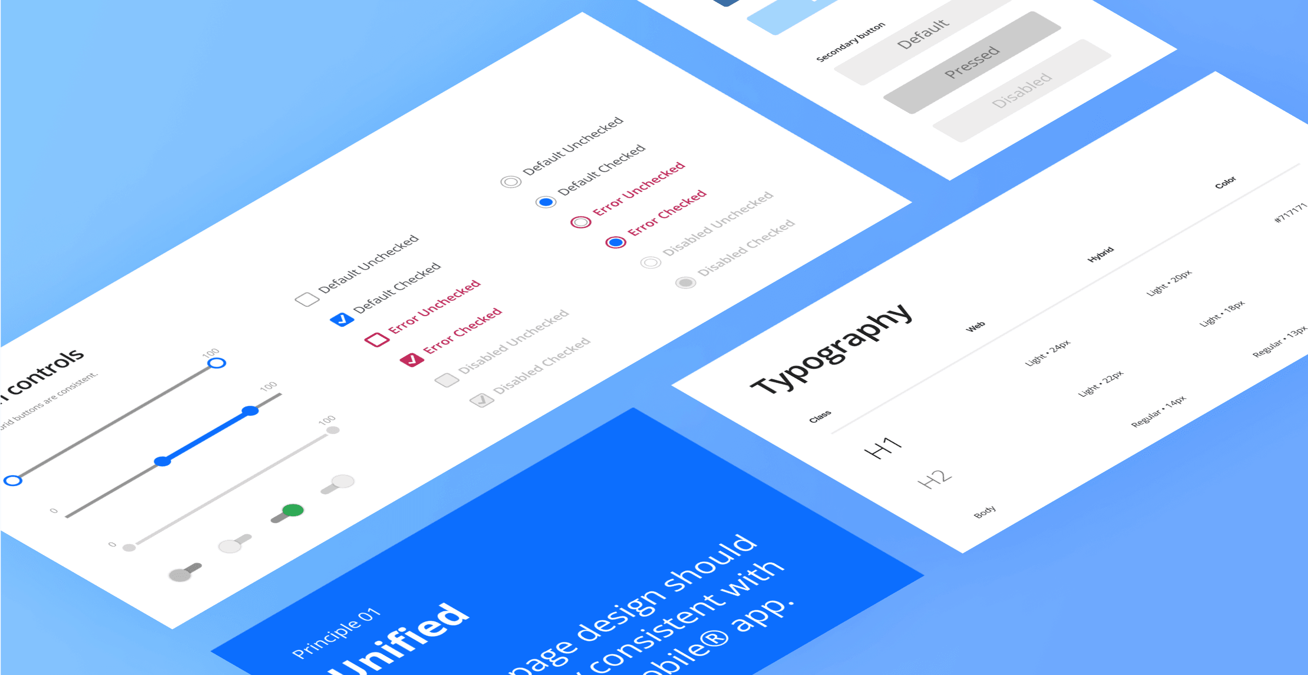
Alignment of design patterns
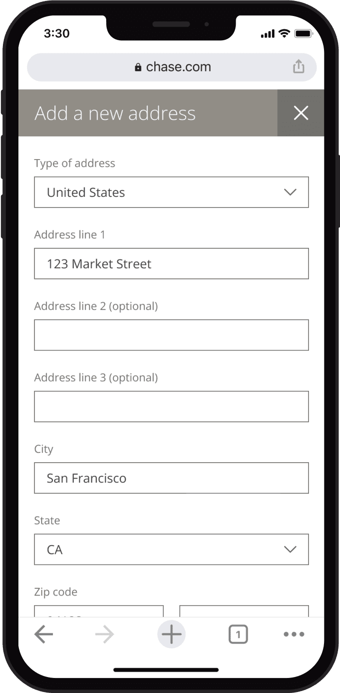
To ensure a seamless integration of web pages into the Chase Mobile® app, it was imperative to harmonize the pattern differences between the two systems. Achieving pattern parity was essential to make web pages indistinguishable from native ones.
Audit and update
To bridge the gap, a comprehensive audit of both design systems was conducted. This audit identified the elements in each system that required updates to facilitate effective hybrid solutions. The key areas we identified for alignment were:
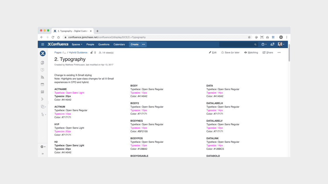
Typography
Typography for mobile web experiences needed to adhere to Chase Mobile app patterns.
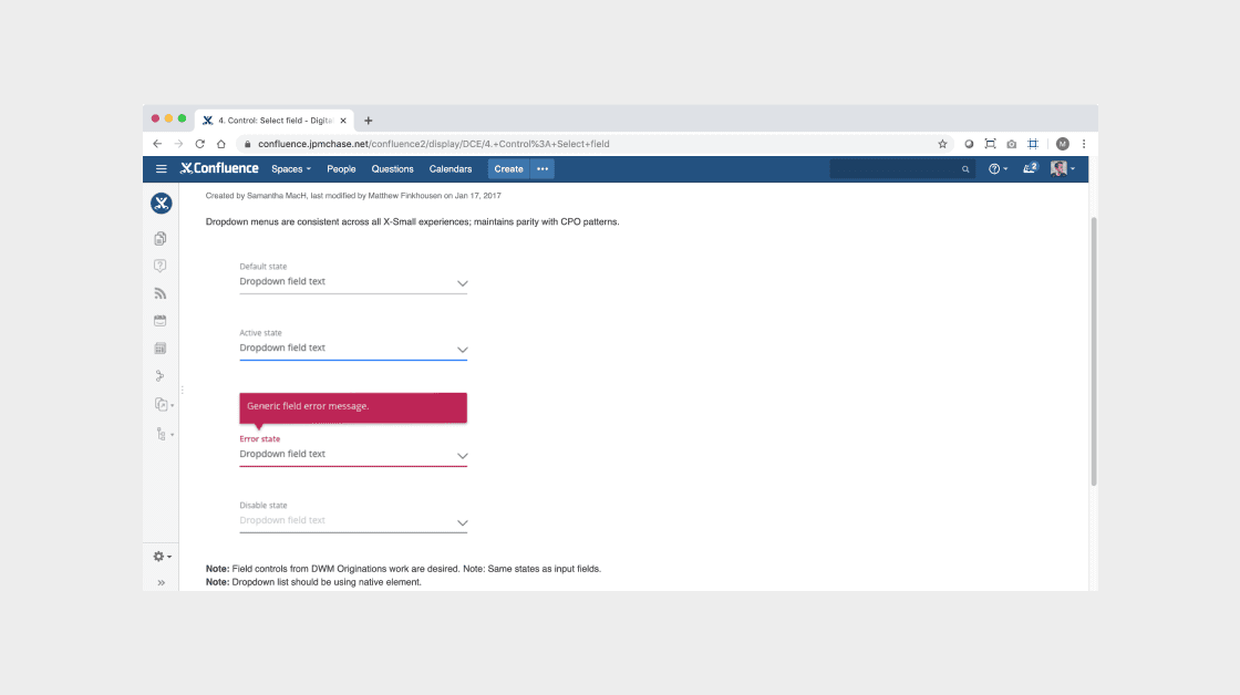
Input fields
Input fields in mobile web experiences were aligned with the Chase Mobile app patterns.
Color palette
Ensuring visual consistency and compliance, all buttons within the Chase Mobile app conformed to Chase Online patterns.
I created guideline documentation on Confluence to allow for easy access by all of Chase's digital product teams and stakeholders.
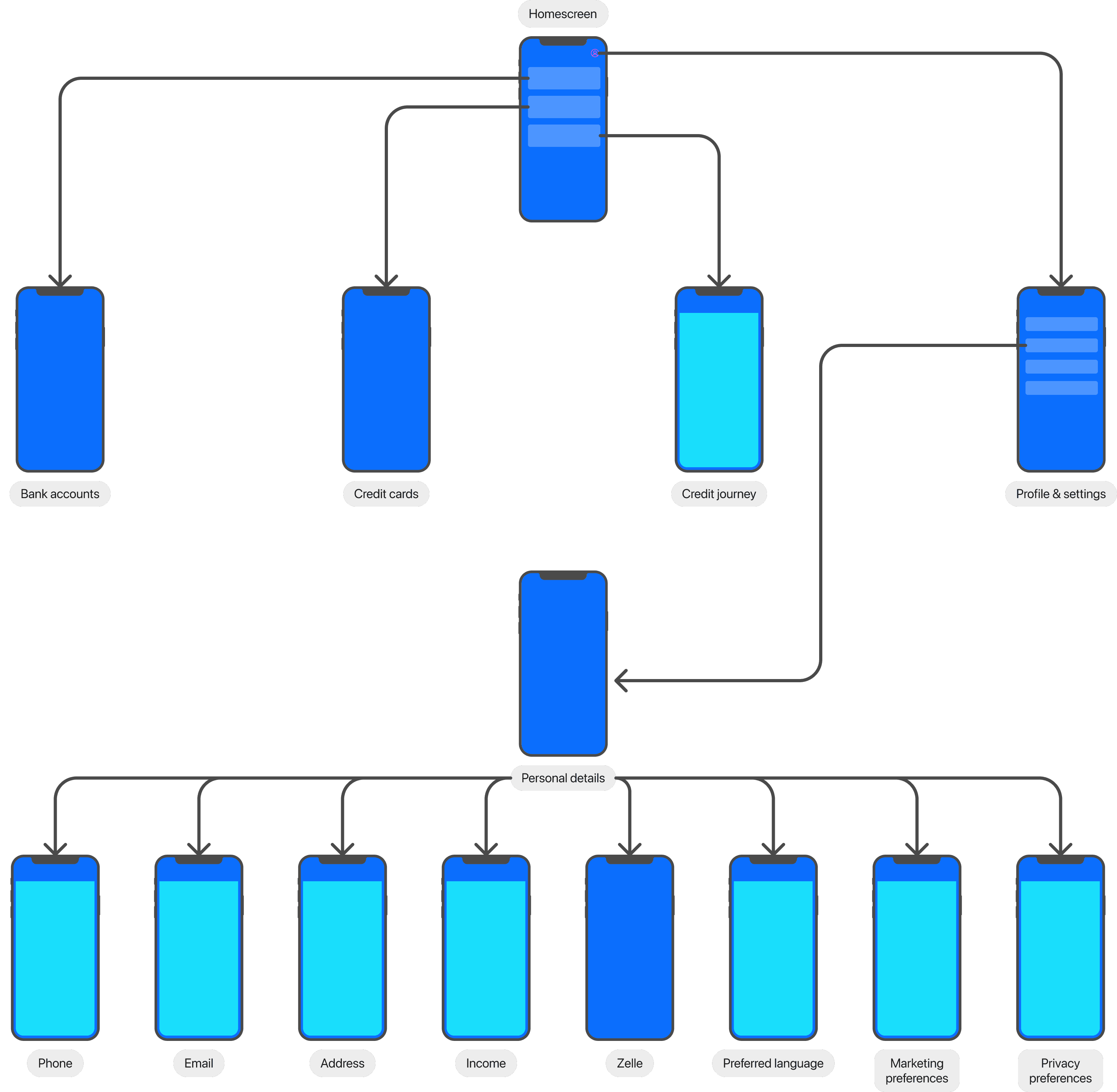
Integrating hybrid into native IA


after