Chase Mobile® App Redesign
Overview
At JPMorgan Chase, I worked extensively on the Chase Mobile® app. During our mobile app redesign, I led numerous initiatives across money movement, cutting-edge security, design language, rewards, and activity monitoring. My primary focus was on building a lovable, extensible banking app from the ground up.
Role
UX
UI
UXR
Prototyping
Objectives
At the time, consumer skepticism surrounding major financial institutions was pervasive. Banks were often seen as predatory, impersonal and self-serving. Our leadership recognized that for Chase to emerge as the trusted leader in the banking space and capture more of the lucrative banking market, we needed to refocus our digital efforts on better serving our customers' real needs.
We embarked on a mission to redefine our brand perception and enhance our mobile experiences in ways that feel authentic, personal and altruistic. We started by focusing on the following big-picture objectives.
Humanizing banking
Challenge users' perceptions of large banks by making banking feel more relatable and approachable.
Elevating convenience
Improve overall convenience through mobile and online channels, making banking seamless and accessible, no matter where a customer is.
Enhance satisfaction
Boost Net Promoter Scores (NPS) for digital products, ensuring a more satisfying user experience.
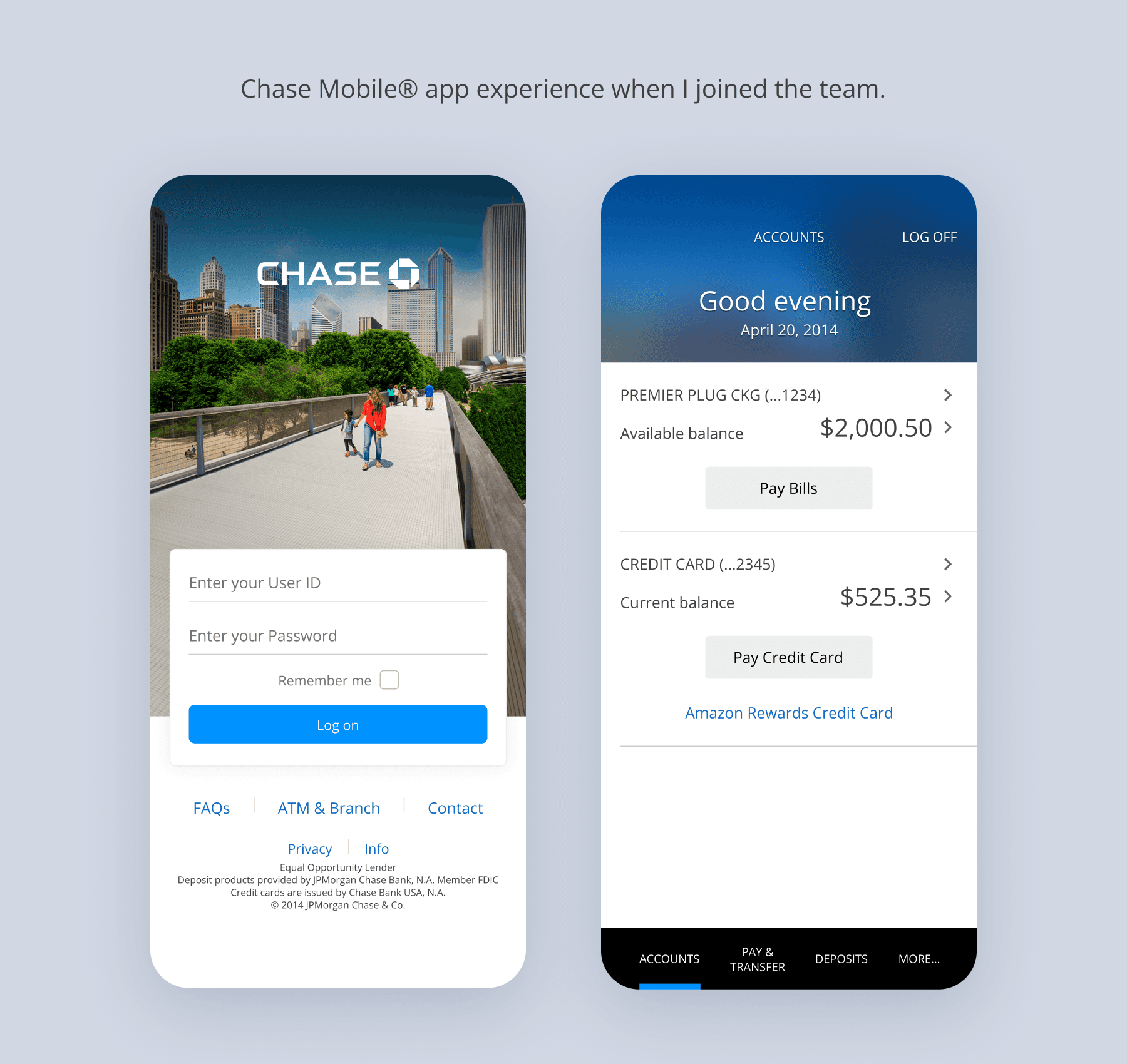
Problem
With the aging mobile platform approaching obsolescence, we recognized several opportunities to rethink the outdated experience and bring something completely fresh, enticing, and extensible.
Market expansion
We reevaluated our priorities to cater to new markets and audiences, providing innovative access to both new and existing products.
Streamline accessibility
Our focus was on reorganizing the platform for ease of use, convenience, and scalability, aligning with the evolving JPMorgan product experience.
Personalization
Aligning with our internal mission of "Simple, personal, human", we introduced personalized services and geolocated photography to deliver a more intimate and tailored user experience.
Differentiation strategy
We established three tenets that separate our mobile experience from other banking apps and make JPMorgan Chase feel less like a big bank and more like a trusted companion that gets you.
Photography that celebrates local culture
We hypothesized that bespoke photography for individual regions and city hubs that leans into beloved local landmarks and unique community cultural would provide moments of delight and leave a lasting emotional impression that feels genuine to customers' lives.
Elevating on-the-go experiences
While current users had a positive perception of our existing mobile functionality, simple and convenient access to additional capabilities and banking activities — like check deposit or sending money — would allow people to fit previously cumbersome banking needs into the small pauses in their everyday lives.
One seamless product family
As part of a larger brand and technical refactoring effort across the business, we committed to crafting cross-platform experience cohesion that can hold and exchange information and task progress across all digital experiences, because we recognize users switch between platforms — sometimes during complex tasks.
Selection of features I led
I led the design of several key features that increased security, facilitated on-the-go banking, and enabled the mobile app to scale as the customer originated more Chase products.
Touch ID authentication
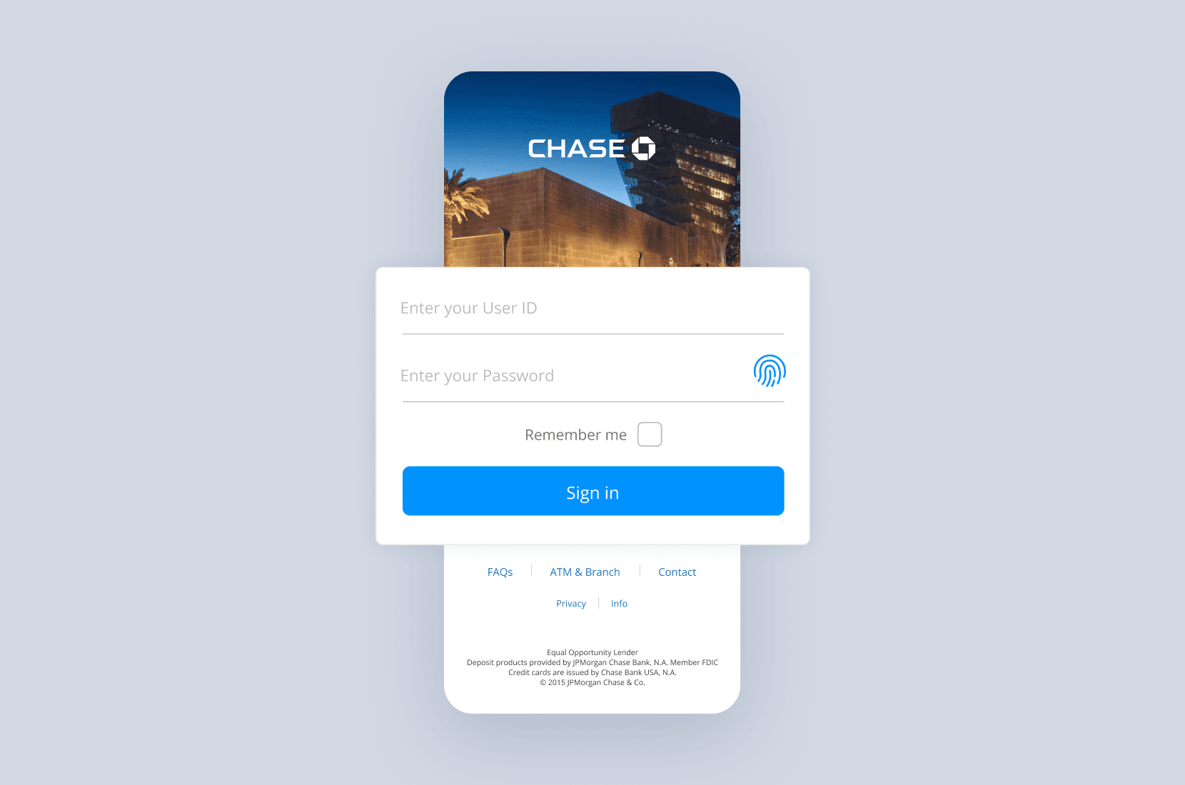
I led the design of Touch ID, providing customers a more secure way of signing-in. At the time, Touch ID was a brand new security feature from Apple. Adopting this cutting-edge technology solidified Chase as a pioneering major bank, being the first to offer Touch ID as an innovative authentication option.
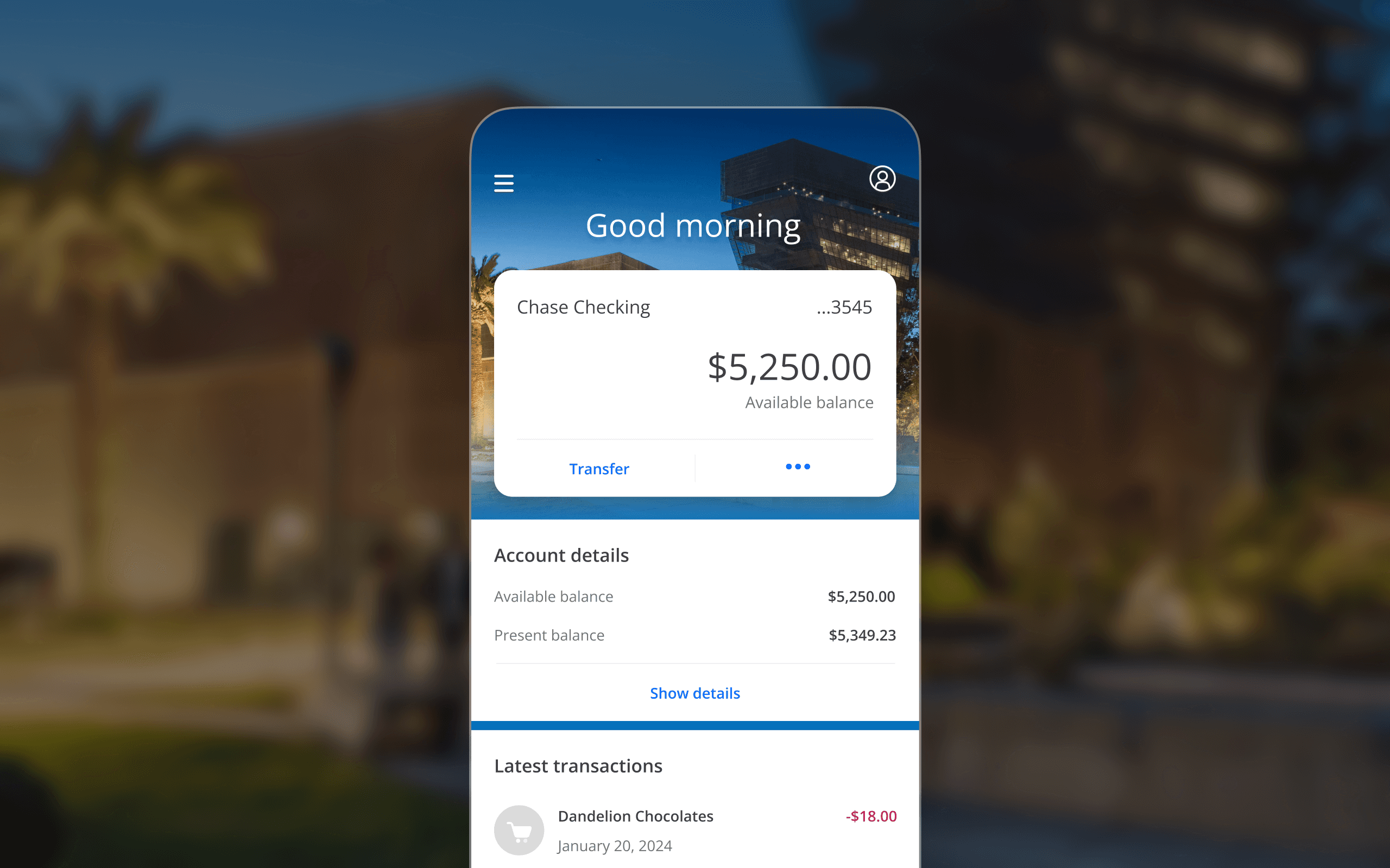
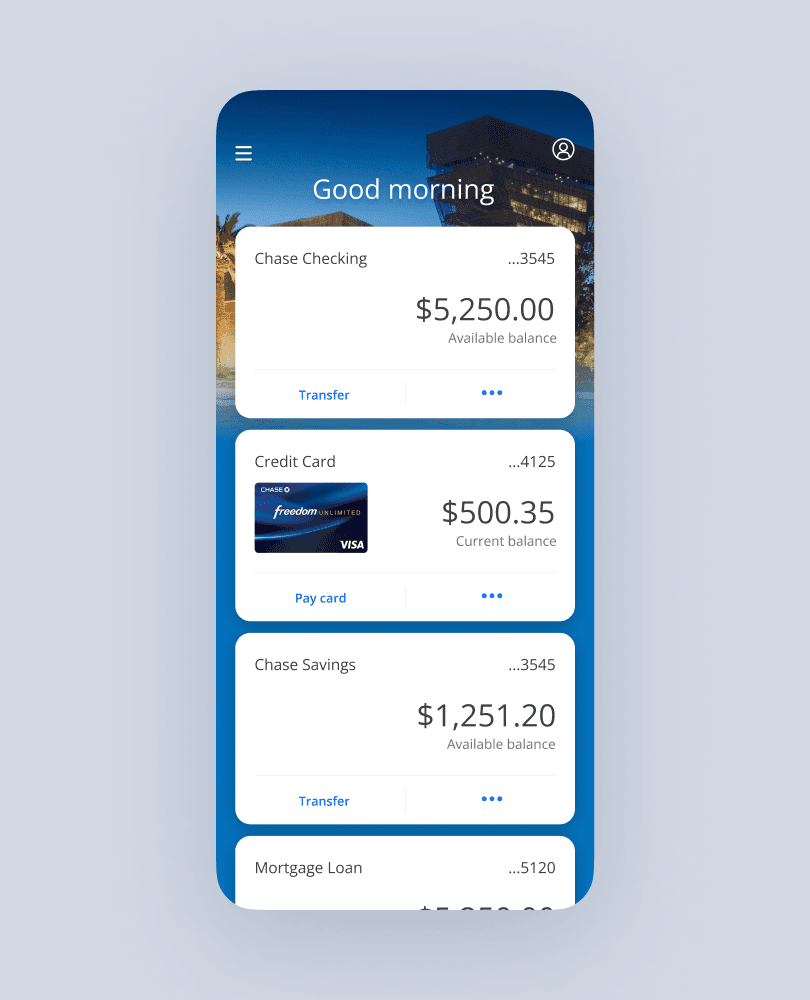
Home screen
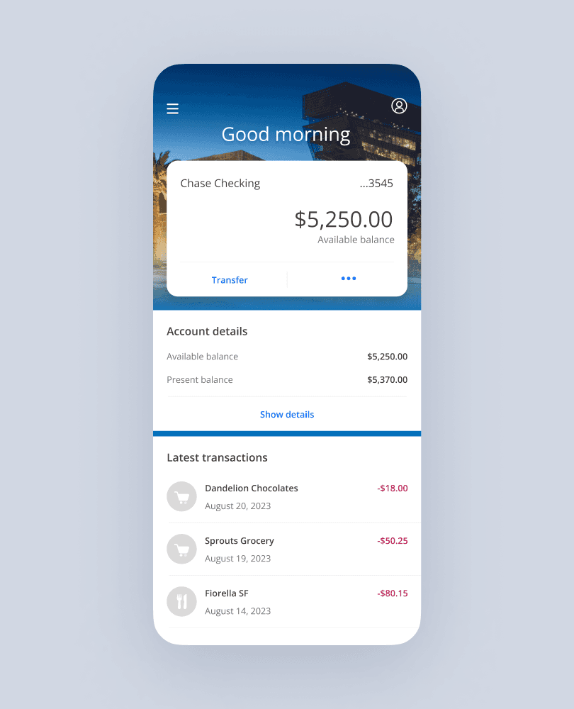
Single account experience
Multiple accounts experience
The home screen uses a completely novel (at the time) card paradigm that prioritizes quick overview of and access to customers' existing accounts. One which mimics the experience of physical cards stored in a customer's purse or wallet. Below cards, the home screen displays pertinent and up-to-date transactional information — balances, account details, and latest transactions.
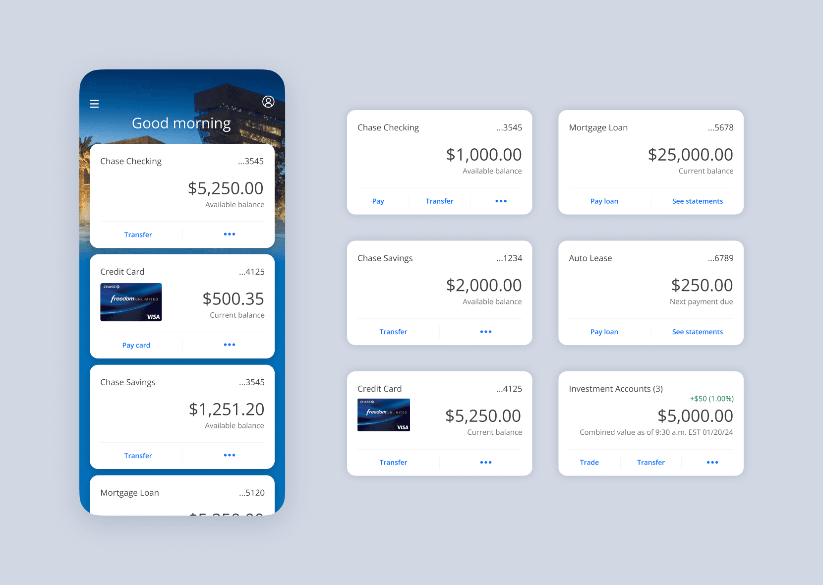
Intuitive account cards offer high-level at-a-glance details for a comprehensive overview. Card anatomy has four primary functions:
Financial snapshot
The card content structure assures that, at a glance, customers can quickly identify all of their accounts, and get high-level insights on the financial status of each.
Quick actions
Each product card has a single quick action on the left-hand side. These quick actions align to the most commonly used feature for each product.
'More' action
Less common actions that customers appreciate having at their fingertips are found by tapping the three-dot 'more' action.
Product dashboard entry point
Tapping on any account card will take the customer to a dedicated product dashboard that offers full details and functionality.
Account transaction history
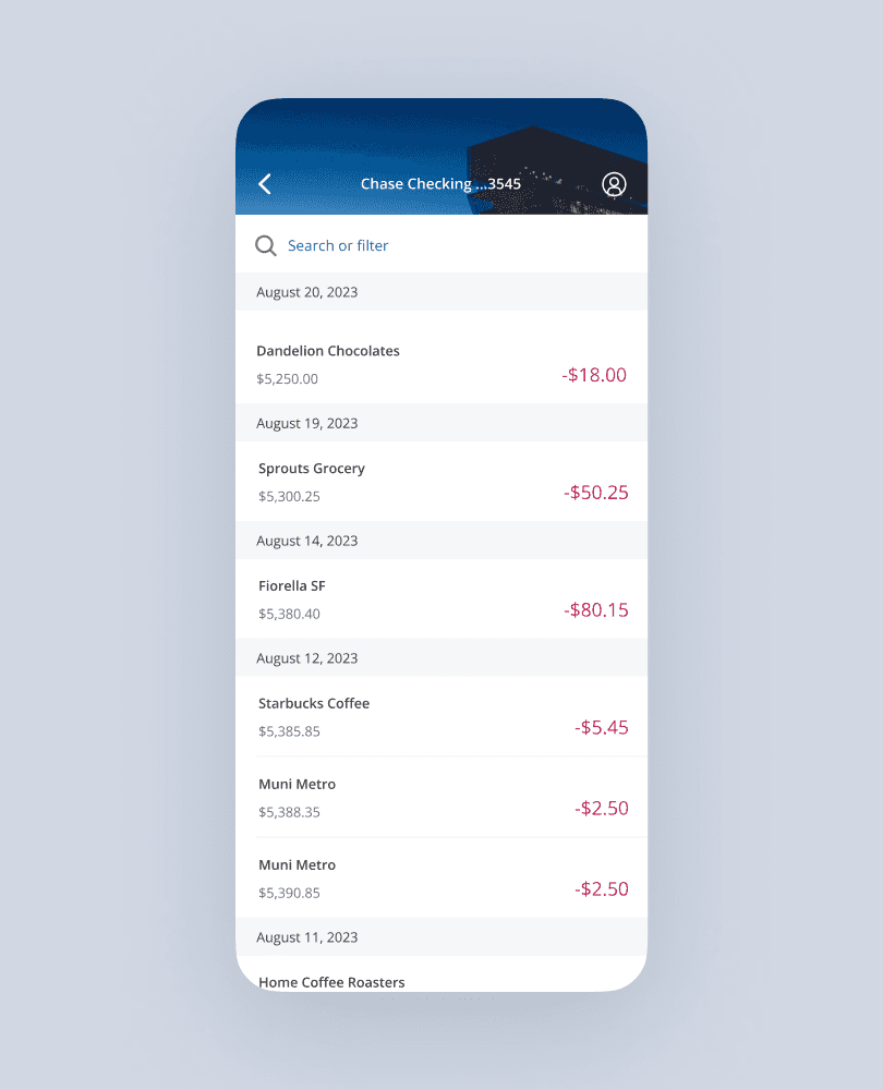
Debit account transactions
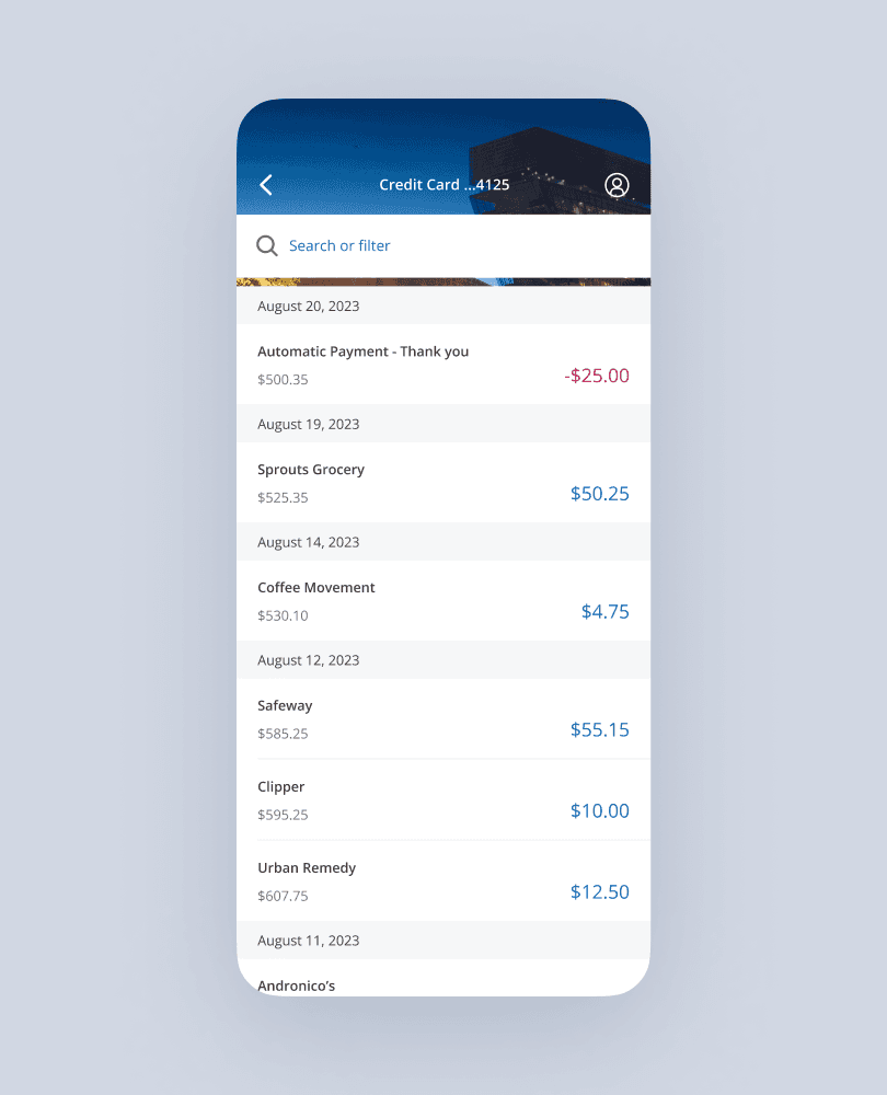
Credit account transactions
Transaction history provides a clear and organized list of transactions, including current, available, and running balances. It provides detailed transaction amounts, dates, and seamless search and filtering capabilities.
Credit transactions differ from debit card accounts. Debit purchases are displayed in negative values, as they are reducing the money available in the account. Credit charges are displayed in positive values as they increase balance owed, with payments made to the balance displayed with negative values, as card payments reduce balances.
Deposit check
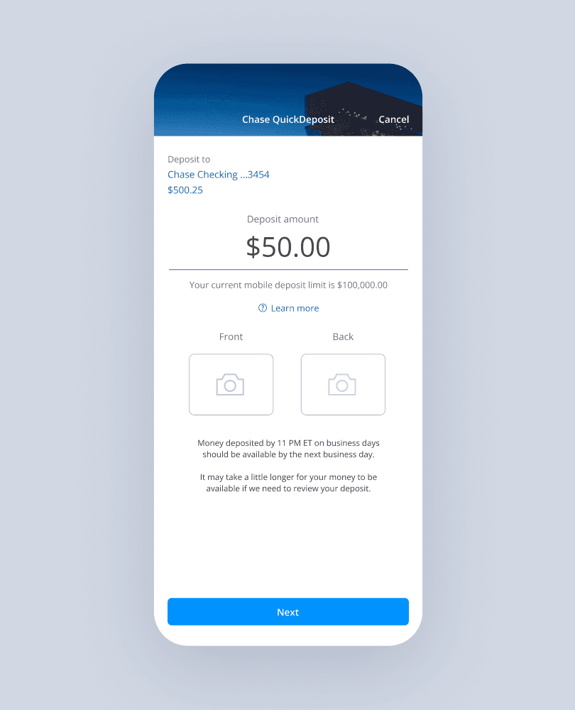
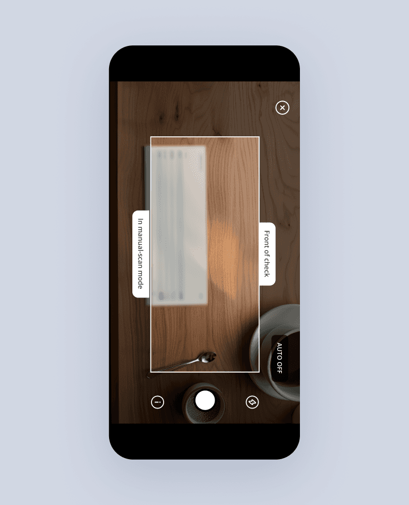
I played a key role in spearheading the design of the Chase Mobile® app's capture check functionality, empowering customers to effortlessly deposit checks with ease and convenience directly from their phone.
Excellerated delivery
Our efforts culminated in the successful delivery of an end-to-end Chase Mobile® app within a span of 5 months.
Building upon these learnings, we expanded our reach to include a responsive solution for consumer online access within the subsequent 12 months.
Impact
8% increase in app usage
Within the first year of launch, the Chase Mobile® app witnessed an 8% surge in usage.
20 million new downloads
The redesign led to a 22% increase in app downloads compared to the previous year.
30% rise in mobile deposits
The introduction of user-friendly features resulted in a 30% increase in mobile deposits.
80% growth in peer-to-peer payments
Peer-to-peer payments grew 80%, showcasing the positive reception of the improve digital products.