Chase Hybrid Design Strategy
Measuring up
In June, 2017, J.D. Power published the first annual Banking App Satisfaction study that can help U.S. banks wisely invest in mobile banking development.
Analyzing responses from 5,564 retail bank customers nationwide, J.D. Power identified top-performing mobile banking apps as well as specified what content and tools can increase mobile banking adoption.
Panic in leadership
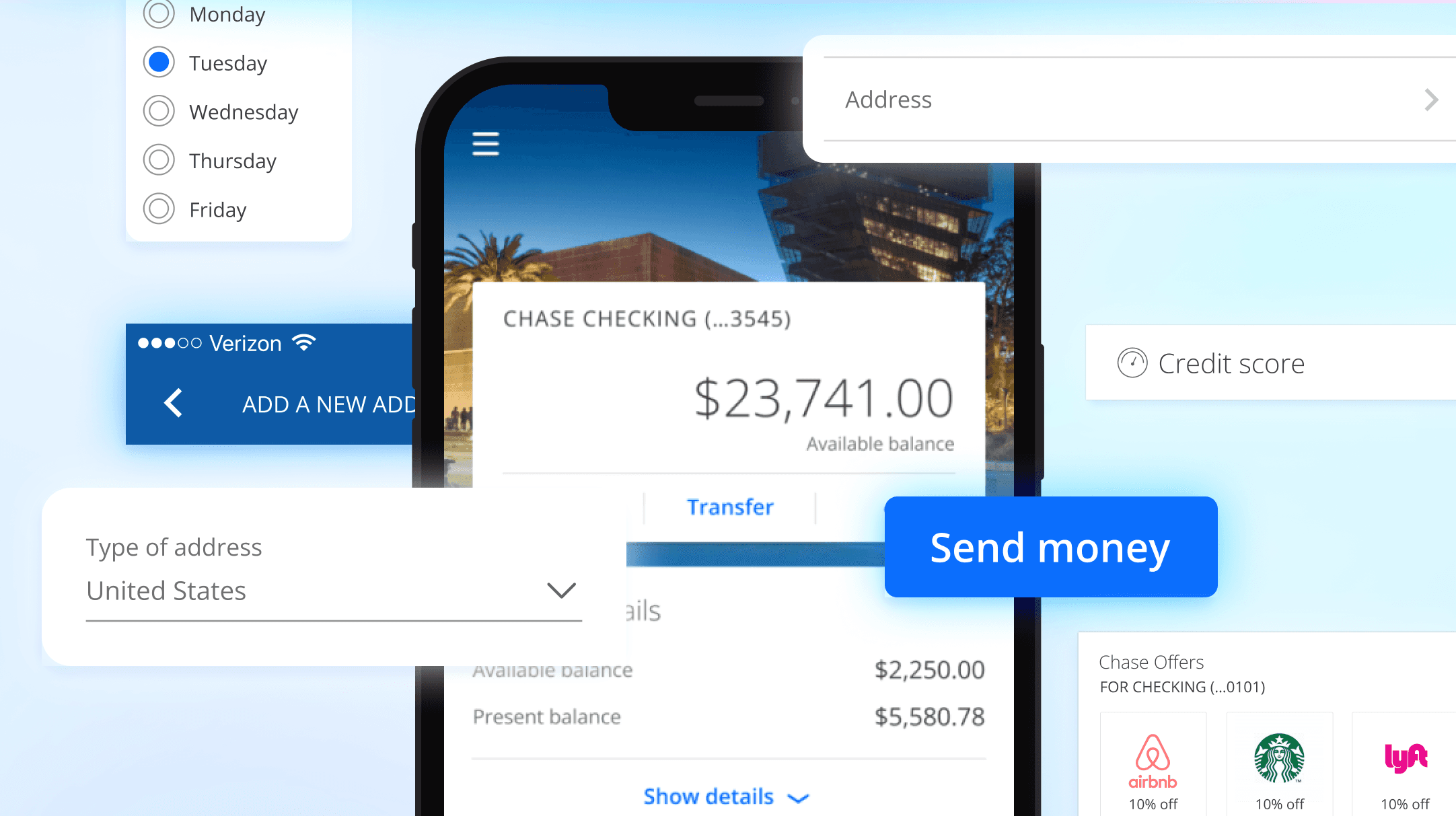
The report highlighted that compared to our competitors, Chase had significant feature gaps within the Chase Mobile® app (e.g. updating an email address.)
Leadership took action and came to our digital organization demanding the feature gap be closed immediately.
The Chase native team responsible for all feature deployment within the app was too small to take on additional work, creating a bottleneck and inability to prioritize these features.
Leadership approached me for solutions
Chase's design leadership approached me, as I had led design on native, web, and design systems teams. My extensive experience across these areas gave me a unique perspective on how we might quickly reduce this feature gap, and maintain a high quality bar within the Chase Mobile® app.
I knew these features were already available on web, which presented an opportunity to do things differently.
How might we
Bring web features into the Chase Mobile® app without building them from scratch?
Experience strategy
Maintaining the Chase Mobile® app high quality bar of excellence meant an experience strategy was needed. Simply framing in existing web pages risked degrading the overall native experience.
Consistent navigation
The Chase Mobile app and chase.com used different navigational conventions.
If chase.com pages were framed-in to the native app, the navigation would need to work exactly like the existing app.
Simple
The Chase Mobile app experiences are simple and bite-sized, without a lot of unnecessary, complex content.
If we were to frame-in web pages into the native app, they would need to have the same simplicity in the presentation of information.
Delight
Customers should be unaware that they are viewing a web page within the native app.
Designs should be consistent with the native app, such as typography, color, components, and latency.
Guiding principles
Unified
Designs for hybrid pages should be visually consistent with Chase Mobile app pages.
Usable
Users should not be able to tell that they’ve left a native environment.
Simple
Areas with a lot of functional complexity that don’t make sense to mobile users should be suppressed when possible
Fast
Performance should be on-par with a native experience.
Playbook guidelines
We defined three types of experiences to help understand when experiences should be native or hybrid.
Hero
• Key experience or delighter
• Differentiates JPMC
• Central to brand
• High-use or high-value to the customer
Core
• Essential experience
• Competitive parity
• Broad use
Long tail
• Expected experience
• Infrequent use
• Central to brand
• MVP/pilot release