JPMorgan Chase
Lead Design of Strategy • Research • UX • UI
At Chase, I took advantage of opportunities to identify ways to improve our internal design processes, including how we design, how we deliver, and how we maintain consistency across our various platforms.
Eliminate feature gap between web and native experiences.
Leverage existing web experiences to accelerate development.
Evaluate the potential of establishing a system to permanently alleviate mobile as a bottleneck.
Maintain the exceptional user experience Chase customers cherish and anticipate.
Many digital Chase experiences were built twice; once for web, and once for native. This was costly to build and maintain, and required Product to decide if they wanted to build experiences for both web and native, or to choose a single platform to deploy to.
This realization sparked our lightbulb moment.
If we could successfully create a strategy to reduce the feature gap and maintain consistency across the platforms, any future experiences could be developed once on web, and deployed within the native app. This could drastically reduce project scope and overall cost.
Cross-platform audit
I had led design across the native and web platforms, and knew there were significant differences between the two that we would have to reconcile and elevate. These differences meant it wouldn't be as simple as framing web pages within the native app.
To create a map of what was happening across both platforms that painted a picture of our UX and engineering opportunities, I completed a deep, thorough audit of the platforms that examined navigation patterns, competing architectures, and level of content details they provided.
Visual differences
I uncovered platform differences in components, typography, and color palettes.
Component differences
Color and typography differed between a variety of components across the two platforms.
Typographic differences
Overall typography within the native app was not visually aligned to their web counterparts, and not AA compliant. Chase strictly adheres to AA standards as required by federal regulation.
Color palette differences
Color palettes were not aligned across the two platforms. This was evident on components, links, and body content.
Navigational differences
I uncovered significant navigational differences between web and native platforms. I brought these findings to design and engineering leadership in order to identify potential solutions that create a unified method of navigation and result in a customer being unaware they were navigating between web and native pages on the Chase Mobile app.
Native navigation
I identified four main navigational features from the Chase Mobile app experience.
Current screen title — Customers know what screen they are on by the screen title being displayed in the native header.
Back arrow — Interacting with the back arrow will navigate the customer back to the previous screen.
Primary button/Skip/Link — Interacting with a primary button/skip/link will take the customer forward a single screen.
Cancel/Done — Interacting with a Cancel/Done button will take the customer back to where they began their workflow.
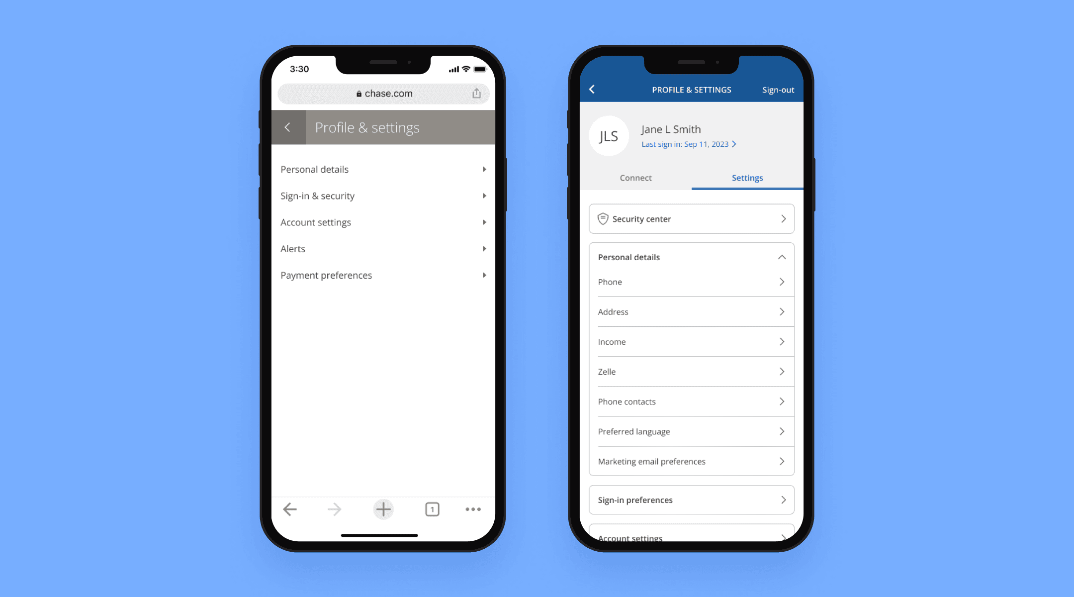
Web navigation
I identified six main navigational features from the Chase online experience.
Current screen title — Customers know what screen they are on by the screen title being displayed on an inline modal header.
Inline model header back arrow — Interacting with the inline model header back arrow will navigate the customer to where they began their workflow.
Browser back — Interacting with the browser back will navigate the customer back to the previous screen.
Primary button/Skip/Link — Interacting with a primary button/skip/link will take the customer forward a single screen.
Cancel/Done — Interacting with a Cancel/Done button will take the customer back to where they began their workflow.
Edit button — Interacting with an edit button opens an accordion experience. For example, if a customer on chase.com clicks an edit button for “Edit email address”, an accordion will open with the necessary fields to make the update. This is a different navigational model than the native app, which didn’t use accordions to reveal edit fields.
Content differences
Content and functionality differed across the native and web platforms, with the chase.com web experience contain the robust, full-functionality of what Chase offers. Experiences on chase.com were designed to be primarily used on desktop, and contains full content details and complexity.
In contrast, The mobile app is an on-the-go companion, with bite-sized tasks, simplified functionality, and less content density and details.
Principles and definitions
I crafted principles and definitions to establish a strategic solution that would enable Chase to frame any webpage within the native app, and for it to be indistinguishable from a native page visually and from an interaction standpoint.
Principles
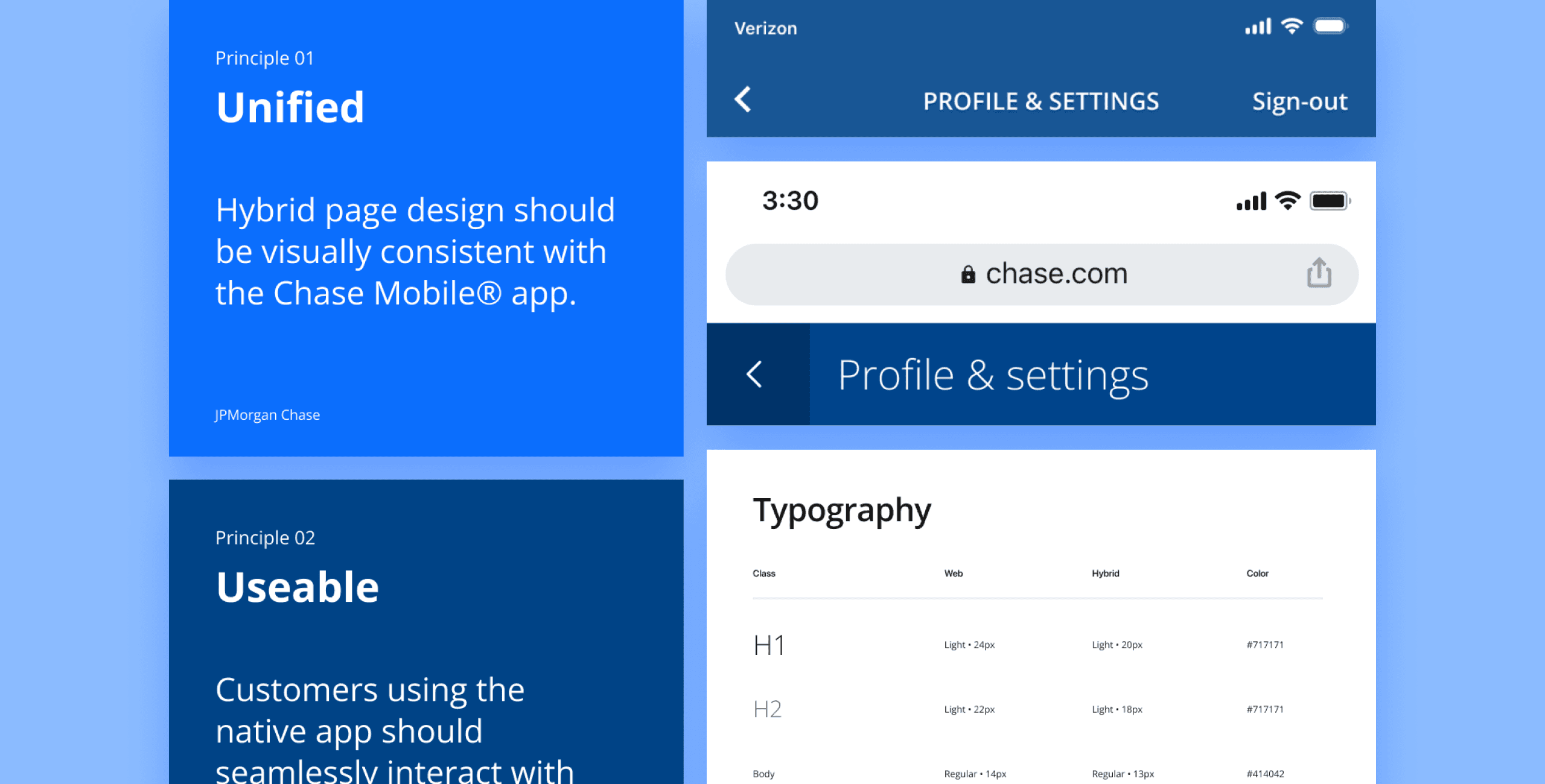
Unified
‘Hybrid’ designs should be visually consistent with Chase Mobile app designs. Customers should not be able to tell that they’ve left a native environment.
Simple
Our commitment was to ensure that all experiences within the Chase Mobile app remained straightforward, eliminating unnecessary complexity. Areas with a lot of functional complexity that don’t make sense to mobile users should be suppressed when possible.
Fast
Performance was a priority, with the goal of matching the speed and responsiveness of a native experience. Performance should be on-par with a native experience.
Definitions
To help Chase make informed decisions on whether to build experiences as fully native, framed pages, or as web-only, I categorized experiences into three distinct types.
Hero product (full native)
Ex: Send money, Zelle, Pay card, view and search transactions.
Core features (framed, utilizing JavaScript + CSS)
Ex: Edit email address, change phone number, update password, view credit score, FAQs.
Long-tail experiences (fully web)
Ex: Terms and conditions, MVP experiments, temporary partnership promotions.
Aligning patterns
Because we wanted to ensure a seamless integration of web pages into the Chase Mobile® app, it was imperative to harmonize the pattern differences between the two systems. Achieving pattern parity was essential to make web pages indistinguishable from native ones.
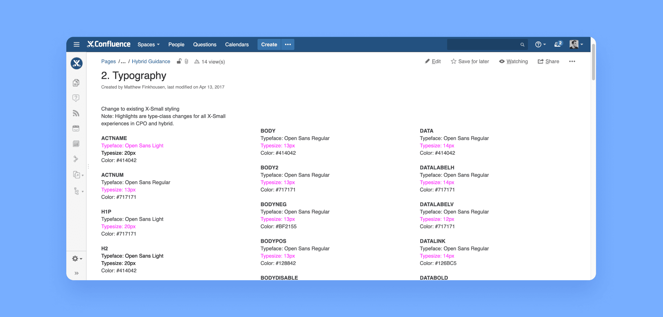
Typography
Typography for mobile web experiences needed to adhere to Chase Mobile® app patterns.
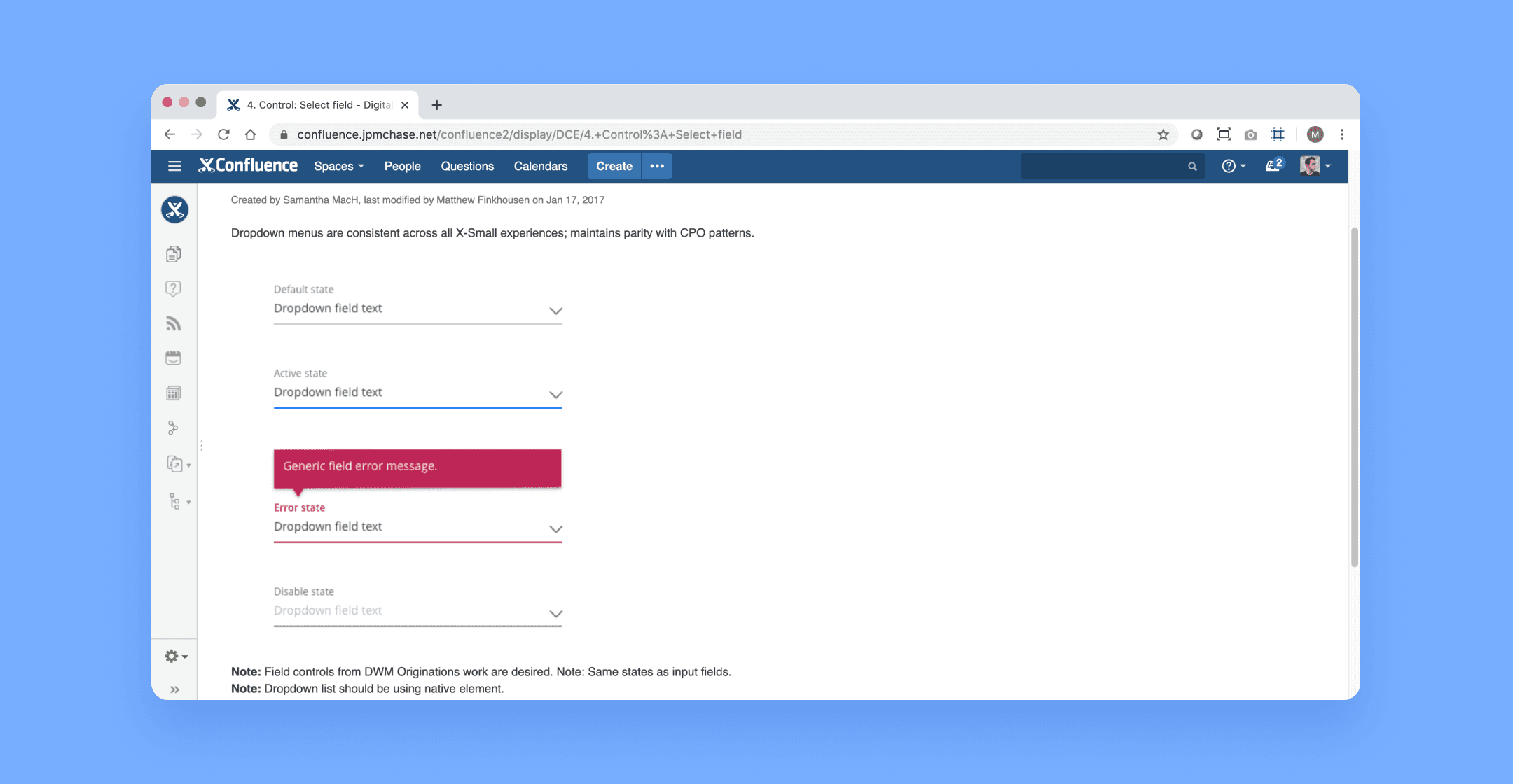
Input fields
Input fields in mobile web experiences were aligned with the Chase Mobile® app patterns.
Color palette
Ensuring visual consistency and compliance, all buttons within the Chase Mobile® app conformed to Chase Online patterns.
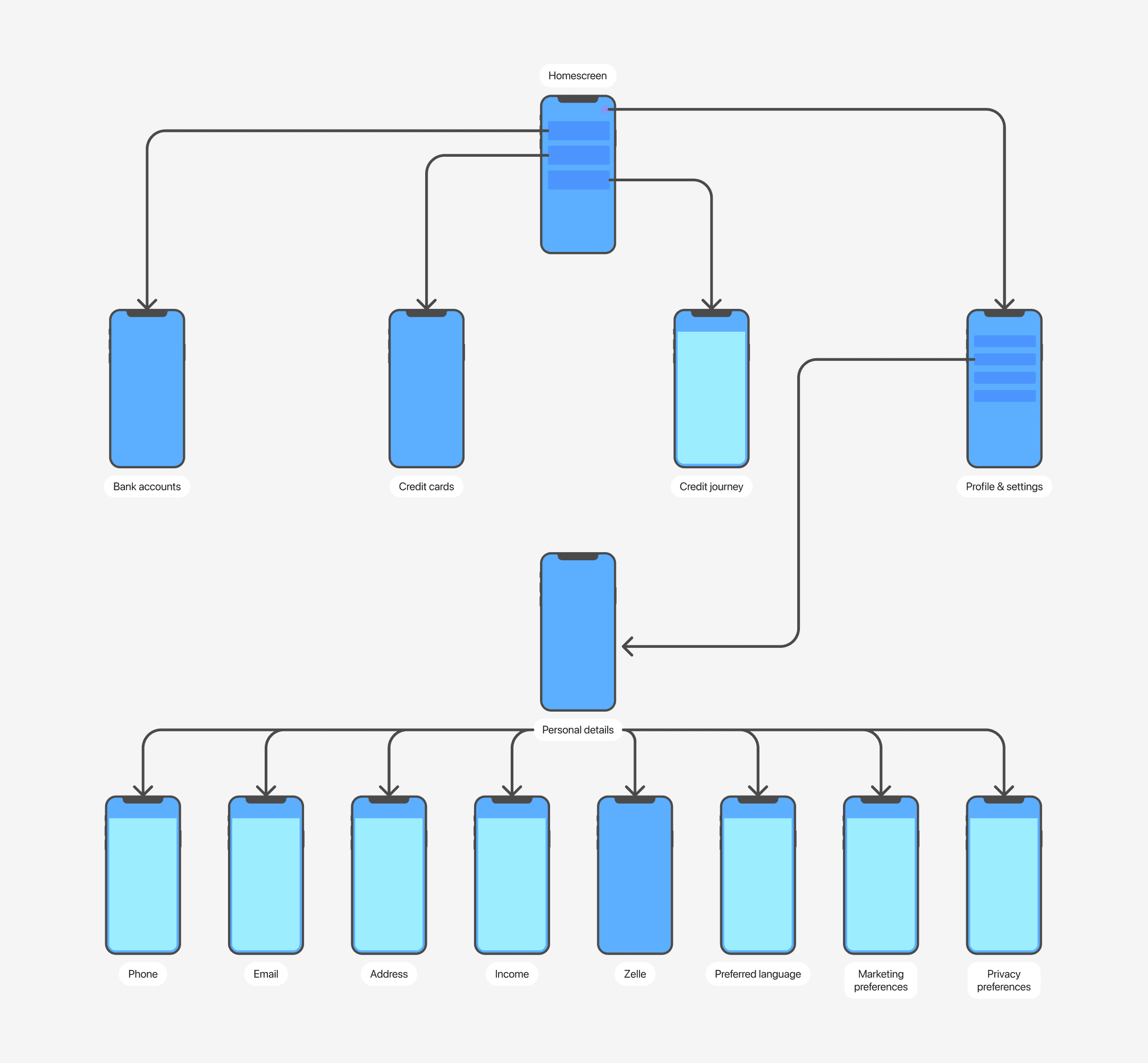
Integration of hybrid and native IA
Solutions
JavaScript bridge
Working closely with the engineering team, we successfully delivered a systematic design approach that could be applied to chase.com pages. Applied, any web page could be deployed to the native app and instantly gain visual and interaction parity with the native experience.
Page title
The JavaScript bridge effectively paints a web screen title into the Chase Mobile app native header.
Back navigation
The JavaScript bridge effectively provides the back functionality from the inline modal header to the native header back arrow.
Simplified navigation
If a web page is viewed within the Chase Mobile app, all inline modal headers are suppressed as to not present duplicate navigation.
Edit functionality
Using feature flagging, new web pages that were created with accordion functionality would have a mobile feature flag. If the browser detects it is being viewed on a mobile screen, it will display the accordion contents on a separate screen, thereby mimicking the Chase Mobile app paradigm.
A successful strategic solution
Utilizing our principles, design language and system enhancements, and JavaScript bridge solution, I was able to quickly update and deploy the missing features that were highlighted in the original JD Power report, with no visual or interaction differences between natively built web pages, and the framed ‘hybrid’ pages.
Design and deploy once
Before this project, Chase lines-of-business would decide what products or features they wanted to deploy for the fiscal year, and budget according to the platform/platforms they wanted to deliver their features to customers. Deploying to both native and web would require building an experience twice, and maintaining two sources of code.
Now, Chase lines-of-business can decide on the products or features they want to deploy, build once, deploy on both platforms, and maintain a single-source of code. It opens new experimentation opportunities via Chase Mobile app, and significantly reduces budgeting of resourcing the native mobile design team.
Hear the full story from kickoff to impact
Learn more about the process, how we deployed, provided guidance, reduced feature gap, and exceeded business goals multiple times over.