Chase Mobile® App Web View Integration
JPMorgan Chase
A streamlined approach to digital service design, enabling rapid development for the native app, enhancing chase.com mobile user experiences, and reducing maintenance down to a single source of code.
My role
Lead Design of Strategy • Research • UX • UI
JP Power highlights feature gaps
When JD Power published its first mobile banking report, it highlighted that although Chase's mobile app was the world's highest-rated banking app, embarrassingly, it still had essential feature gaps other banks had closed and that our customers saw as baseline.
The report highlighted features that were already available on chase.com, such as the ability to change an email address or edit your password. Because these features were available on web and previously seen as lower priority, they had never made it into the app.
Leadership quickly approached our team to bring the app to parity, where it also became painfully evident that though our mobile design and engineering teams were high performing, they were also already beyond their bandwidth capacity. Adding this work would require significant cuts to the existing roadmap.
Today's problems are an opportunity for tomorrow's success
At this time, I was a lead designer on the mobile team. Having been a key designer in building both the Chase Mobile® and Freedom apps, and previously owning the cross-platform design language systems and accessibility best-practices, I had a deep and unique understanding of the broader ecosystem and the fine details that went into each.
This broader perspective sparked an idea that while leadership's request was parity as soon as possible, we might have an additional opportunity to build a system that would allow us to deliver faster today, and continue to deliver everything faster in the future, while also raising experience quality across the entire ecosystem.
Key objectives
Eliminate the feature gap between web and app experiences
Leverage our existing web experiences to accelerate development
Evaluate the potential of establishing a system to permanently alleviate mobile as a bottleneck, all while upholding the exceptional user experience our customers had come to cherish and anticipate
Investigating existing shortcomings
Because I had led design across the native and web platforms, I knew there were significant differences between the two that we would have to reconcile and elevate. These differences meant it wouldn't be as simple as framing web pages within the native app.
To create a map of what was happening across both platforms that painted a picture of our UX and engineering opportunities, I completed a deep, thorough audit of the platforms that examined navigation patterns, competing architectures, and level of content details they provided.
Navigational differences
We reviewed the primary navigation for both mobile chase.com, as well as the Chase Mobile app in order to better understand the similarities and differences in how they functioned.
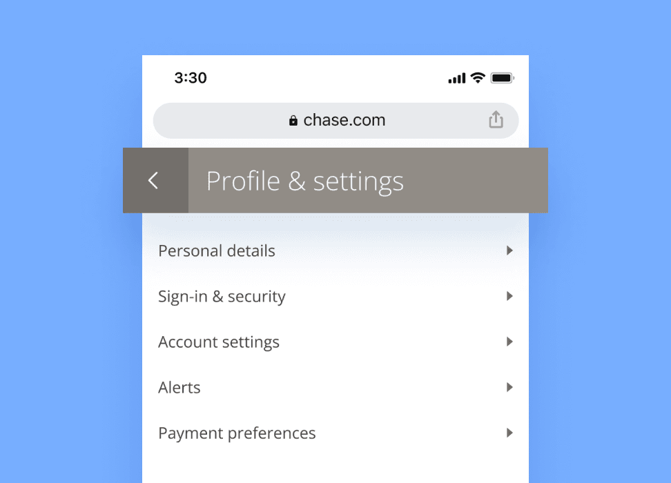
Web navigation via an inline modal header
Screen title, as well as "Back" and "Close" navigation are handled by an inline modal header.
The inline modal header back arrow takes the customer to the parent page of the current screen. If a customer taps the "Close" X, it will always return the customer to the web home screen.
Additionally, customers on web can use their browser navigation, which takes the customer back a single step.
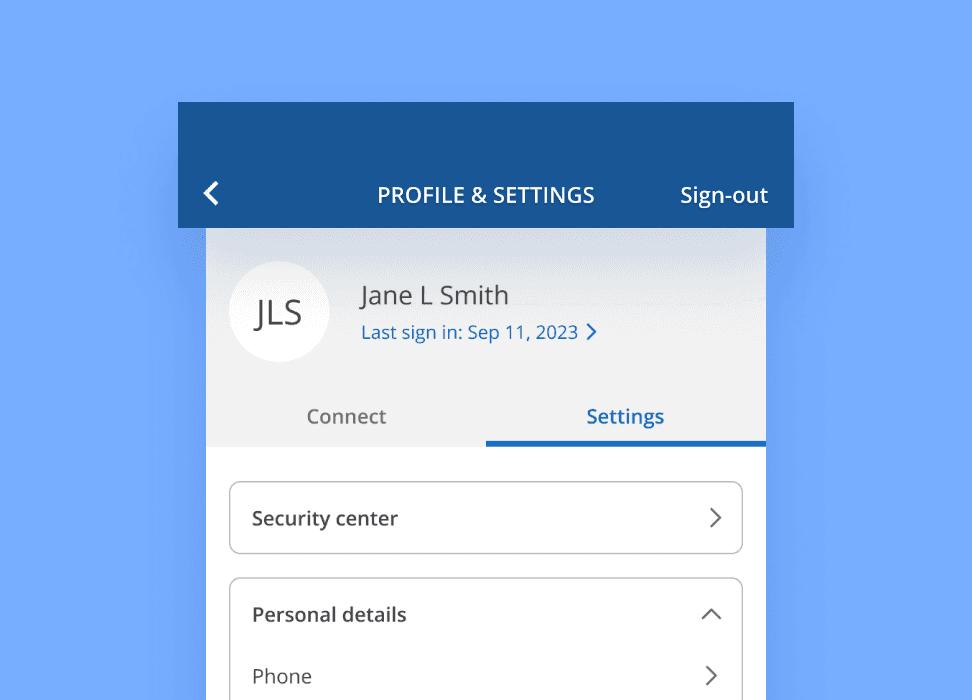
Native navigation via the native header
Screen title, as well as "Back" and "Close" navigation are handled by the native header.
The native header back arrow takes the customer back a single step. If a customer taps "Close", it will always return the customer to the native home screen.
Content differences
We were curious how content differed between chase.com and the Chase Mobile app. After being closely involved on experiences on both platforms, I hypothesized that we would undercover significant differences, as chase.com was initially created for desktop, and the Chase Mobile® app was designed as a task-based companion.
Web content observations
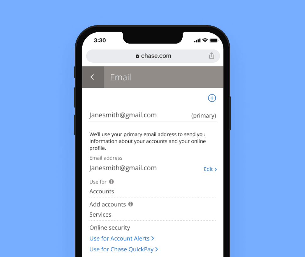
The chase.com web experience contain the robust, full-functionality of what Chase offers. It is designed to be primarily used on desktop, and contains full content details and complexity.
In this example, the customer can see their primary email details, along with additional functionality such as setting up their email for account alerts and QuickPay.
Native content observations
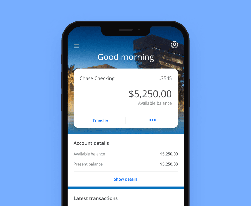
The mobile app is an on-the-go companion, with bite-sized tasks, simplified functionality, and less content density and details.
In the example here, primary account details are displayed by default. Additional, tertiary account details such as "Deposits this month" are hidden under a "Show details" accordion.
Framing web experiences uncovers navigational challenges
We reviewed the navigational challenges that would manifest if we simply framed web pages into the experience. To begin, we created mockups of the Chase Mobile app that included framed chase.com web pages.
Next, we discussed how a customer would navigate the mobile app. We discovered the potential for navigational redundancies and undesirable navigational behaviors.
Native
Framed webpage
Native header and framed view
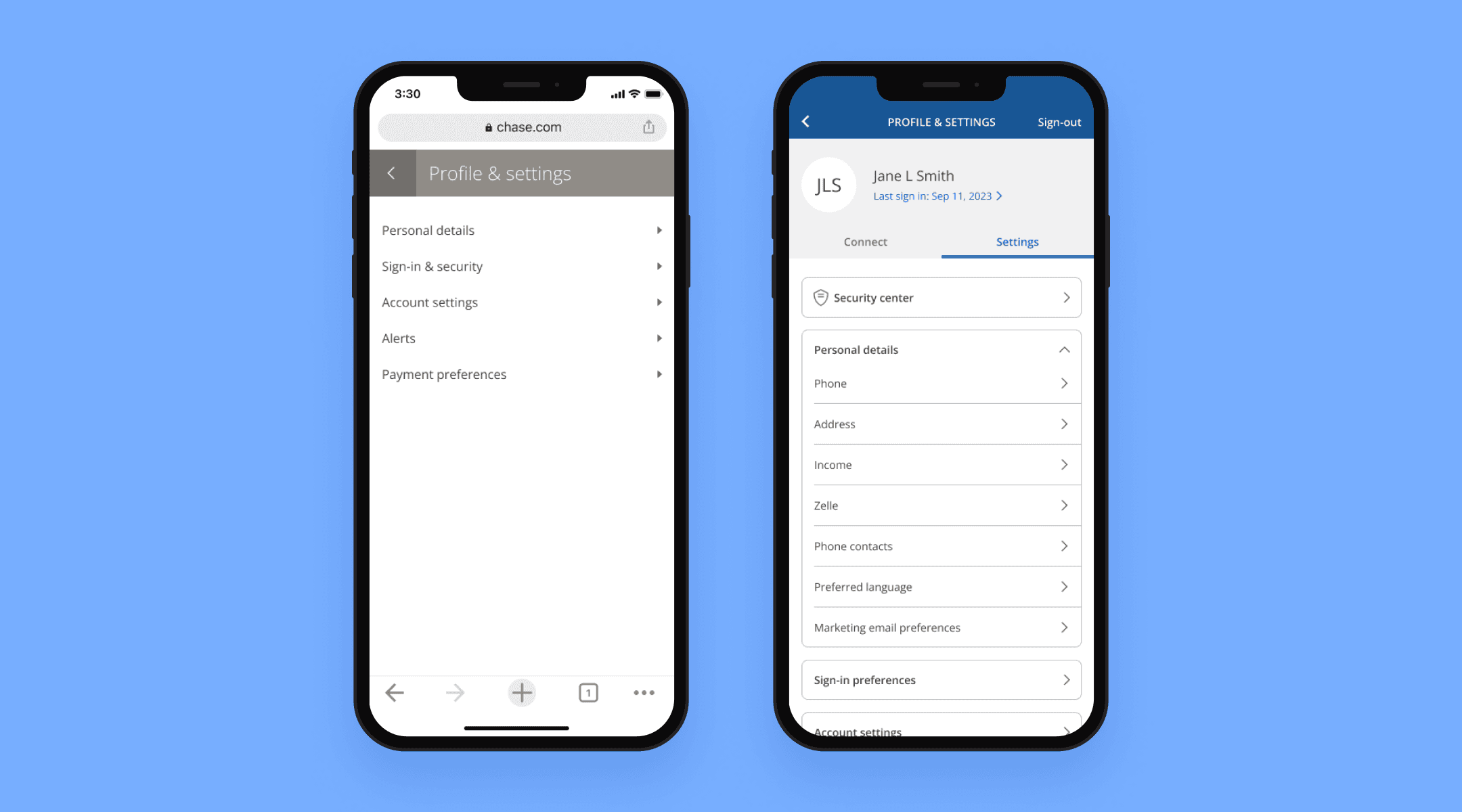
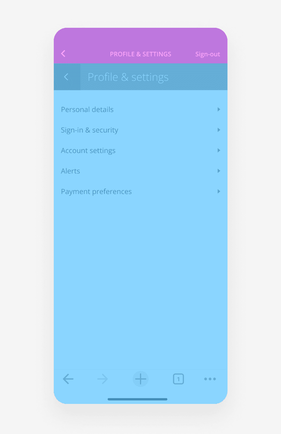
To better understand the challenges of framing in web views, here we can see what is native, and what is framed in.
At the top, the native header provides details of where the customer currently is (Profile & settings), the ability to go back to the previous native page, and the ability to sign out.
Below is the framed web view. In this example, the inline modal header provides details of where the customer currently is (Profile & settings), and the ability to go back to the previous web page.
What happens if we simply frame a web page?
After working with engineering with proof-of-concepts, we immediately uncovered undesirable navigational issues.
Without suppression of the web inline modal header, the two navigational headers conflict with each other.
Example: A customer who interacts with a webpage header framed within the native app could easily navigate to their web home screen. Not only is this not ideal, it would maintain the original native header. It is entirely possible to see a native header title "Email", but viewing a framed web home screen.
Strategy, not just parity
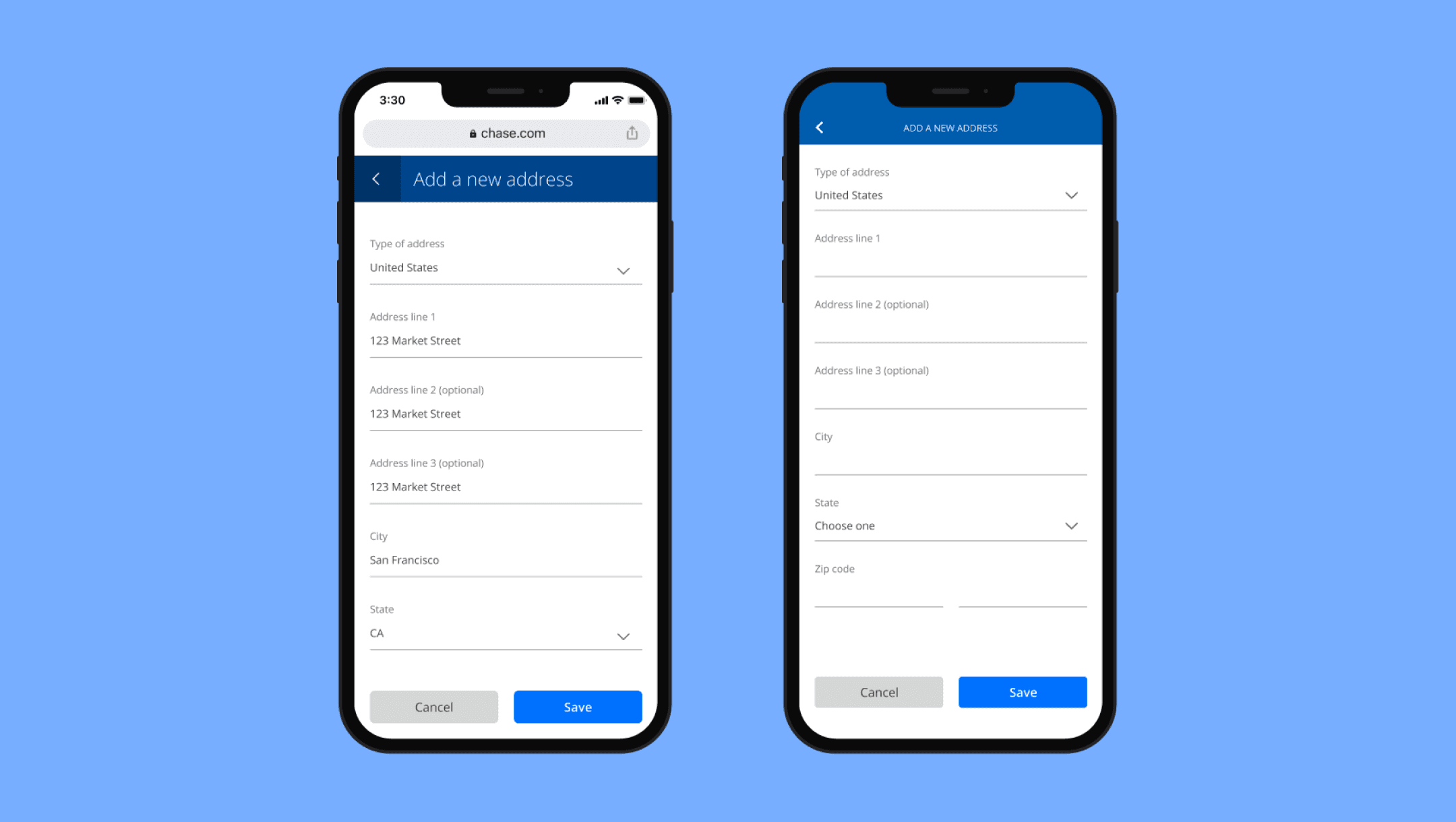
We wanted to do more than just bridge the feature gap. We wanted to create a strategic solution that would enable Chase to frame any webpage within the native app, and for it to be indistinguishable from a native page visually and from an interaction standpoint.
Experience framework
Acknowledging the possibility of a negative impact on the overall native experience, we approached the task of integrating existing web pages with great caution. Our primary objective was to guarantee that all teams adhered to, if not surpassed, Chase's established high-quality standards for its native app. To achieve this, we adopted and wholeheartedly committed to the following strategic framework:
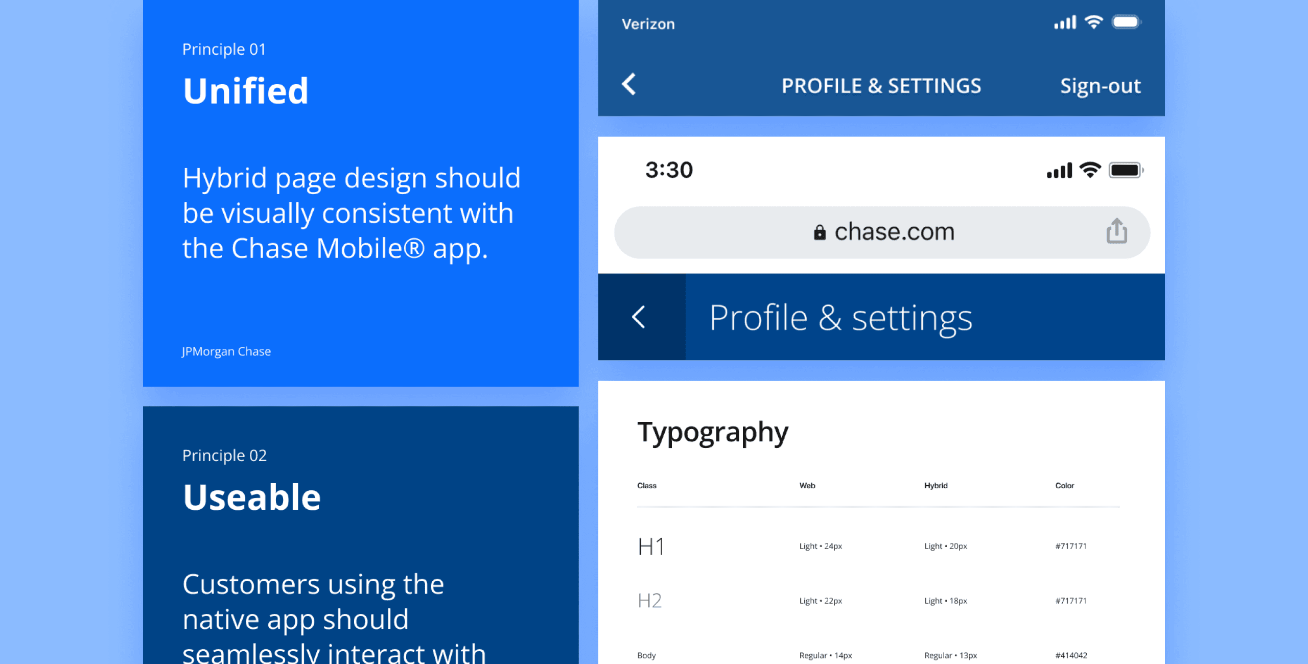
Unified
Our designs for hybrid pages were required to maintain visual consistency with Chase Mobile® app pages.
Usable
Customers using the native app should seamlessly interact with framed-in web pages, without realizing they are viewing web content.
Simple
Our commitment was to ensure that all experiences within the Chase Mobile app remained straightforward, eliminating unnecessary complexity.
Fast
Performance was a priority, with the goal of matching the speed and responsiveness of a native experience.
New feature playbook
To make informed decisions on whether to build experiences in native, as framed pages, or as web-only, we categorized them into three distinct types. Each type had its identifying characteristics to guide our choices:
Hero product (full native)
Ex: Send money, Zelle, Pay card, view and search transactions.
Core features (framed, utilizing JavaScript + CSS)
Ex: Edit email address, change phone number, update password, view credit score, FAQs.
Long-tail experiences (fully web)
Ex: Terms and conditions, MVP experiments, temporary partnership promotions.
Integrating hybrid into native IA
Aligning patterns
Because we wanted to ensure a seamless integration of web pages into the Chase Mobile® app, it was imperative to harmonize the pattern differences between the two systems. Achieving pattern parity was essential to make web pages indistinguishable from native ones.
To bridge the gap between the two systems, I conducted a thorough audit of both design systems. This audit aimed to identify elements in each system that needed updates to enable effective hybrid solutions. The key areas we identified for alignment included:
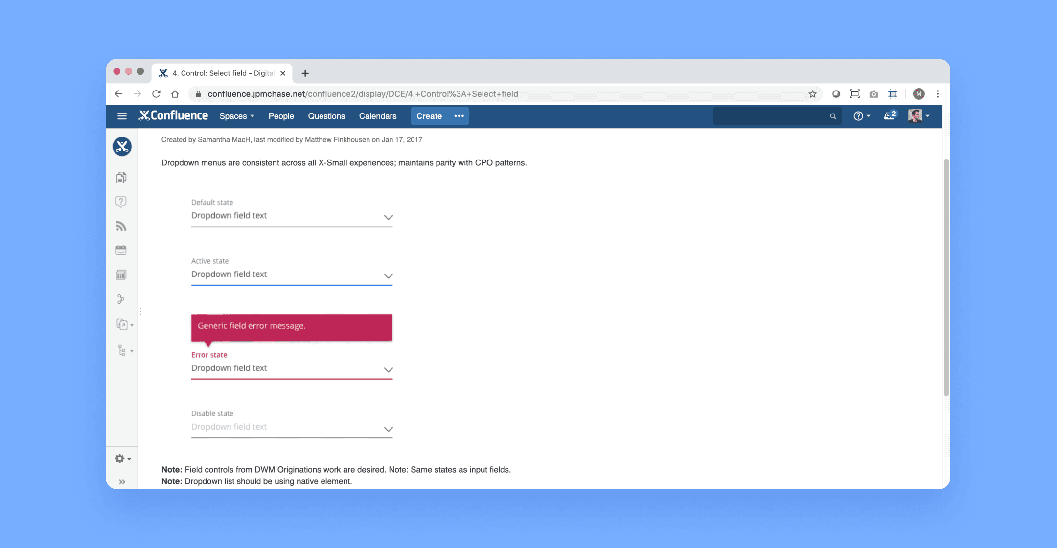
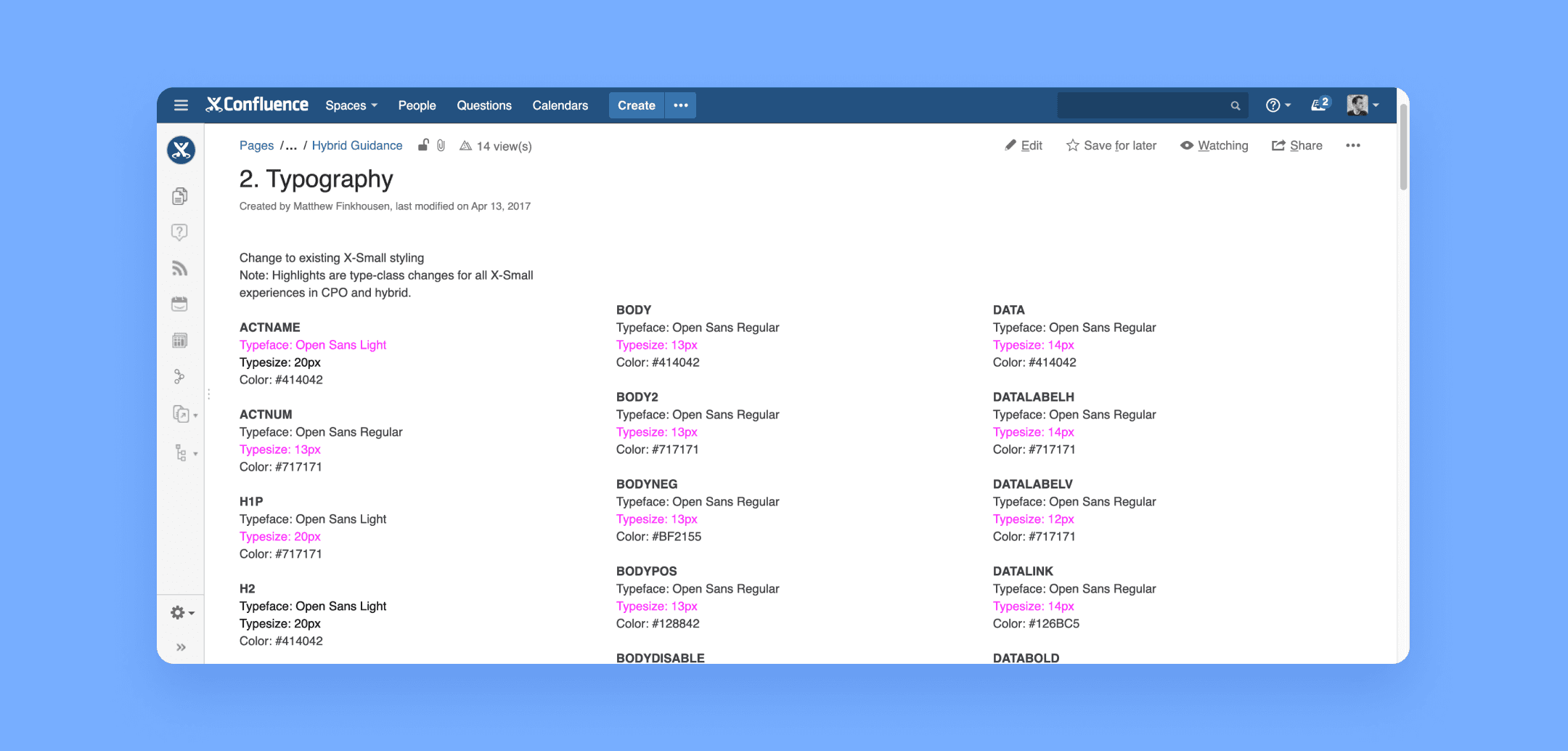
Typography
Typography for mobile web experiences needed to adhere to Chase Mobile® app patterns.
Input fields
Input fields in mobile web experiences were aligned with the Chase Mobile® app patterns.
Color palette
Ensuring visual consistency and compliance, all buttons within the Chase Mobile® app conformed to Chase Online patterns.
Our strategic solution proves successful
Working closely with the engineering team, we successfully delivered a systematic design approach that could be applied to chase.com pages. Applied, any web page could be deployed to the native app and instantly gain visual and interaction parity with the native experience.
Design and deploy once
We enabled teams the ability to build their features once on web with full capabilities and content, deploy them within a native app with complete visual and interaction parity, along with suppression of unnecessary capabilities and content.
Futureproofed maintainence
Now Chase can maintain a single source of code for hybrid pages. If future enhancements are made on the web experience, the pages framed within the mobile app will immediately receive the updates, without requiring the mobile team to add design scope.

These are chase.com webpages that have undergone the hybrid strategy and deployed within the native app.
Hear the full story from kickoff to impact
Learn more about the process, how we deployed, provided guidance, reduced feature gap, and exceeded business goals multiple times over.