App Redesign Reset
Overview
At Varo Bank, I led a redesign effort that brought two siloed teams together to produce a design language and system. Influenced by Varo's unique customer base, we sought to release an updated app and website that leveraged the skills each team brought to the table.
Role
UX
UI
Team Building
Workshopping
Prototyping
Objective
Release a scalable design language and system inspired by Varo's unique customer base that demonstrates a shared visual and interaction approach from the product design team and the marketing team.
Marketing drives a redesign
The Varo marketing team produced a new design language influenced by skeuomorphic trends and confident, bold typography. The team also proposed new customer services, such as choosing custom colors and avatars to further customize their banking experience.
Driving co-creation
I anticipated the product design team would be both surprised and confused why we were left out of this redesign process. I also grew concerned that the marketing team was working in a space they were unfamiliar with in regards to design, scalability, accessibility, and general usability practices — and without any assistance from the product design team.
Preventing silos
In order to re-establish a cohesive team structure and communication between the marketing and product design teams, I reached out to their leadership. I wanted to know how they were doing, better understand what they were tasked with, what was working and what wasn't working, and how our product design team could pivot this project in a way that could bring the teams together to co-create a redesign.
Product design team approach
Condensed timeline
Because designs had to be handed to engineering by the end of the current sprint, our team needed to explore, refine, produce, and deliver our final designs in less than two weeks.
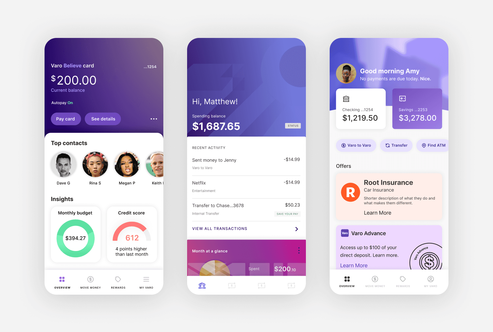
Product design team — app UI/UX
I led co-creation sessions with a select group of product designers, working closely together to quickly explore designs and produce designs that were on-brand, accessible, and scalable.
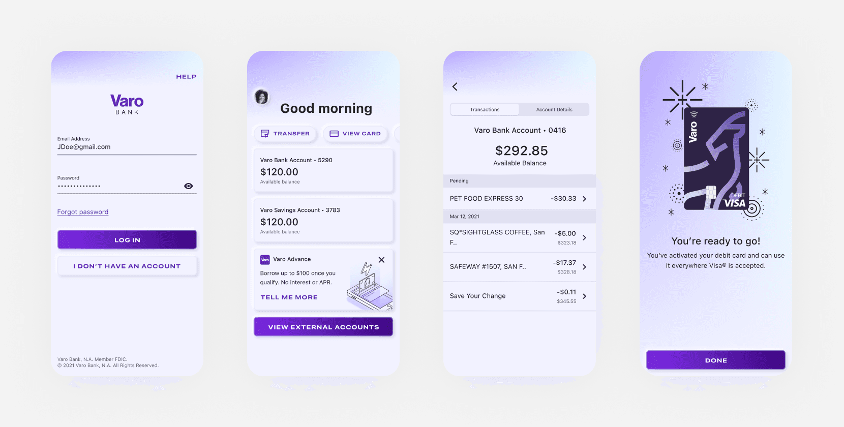
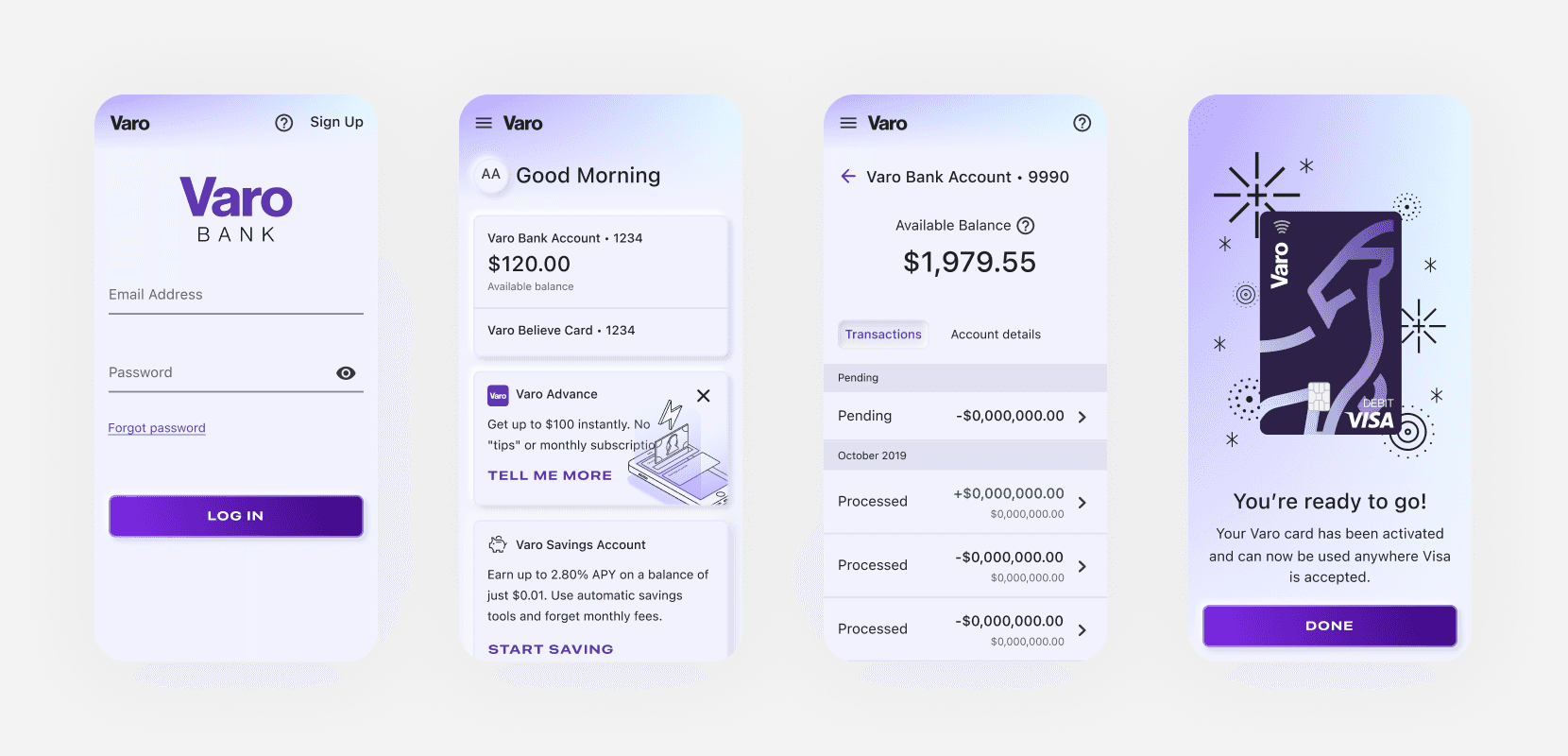
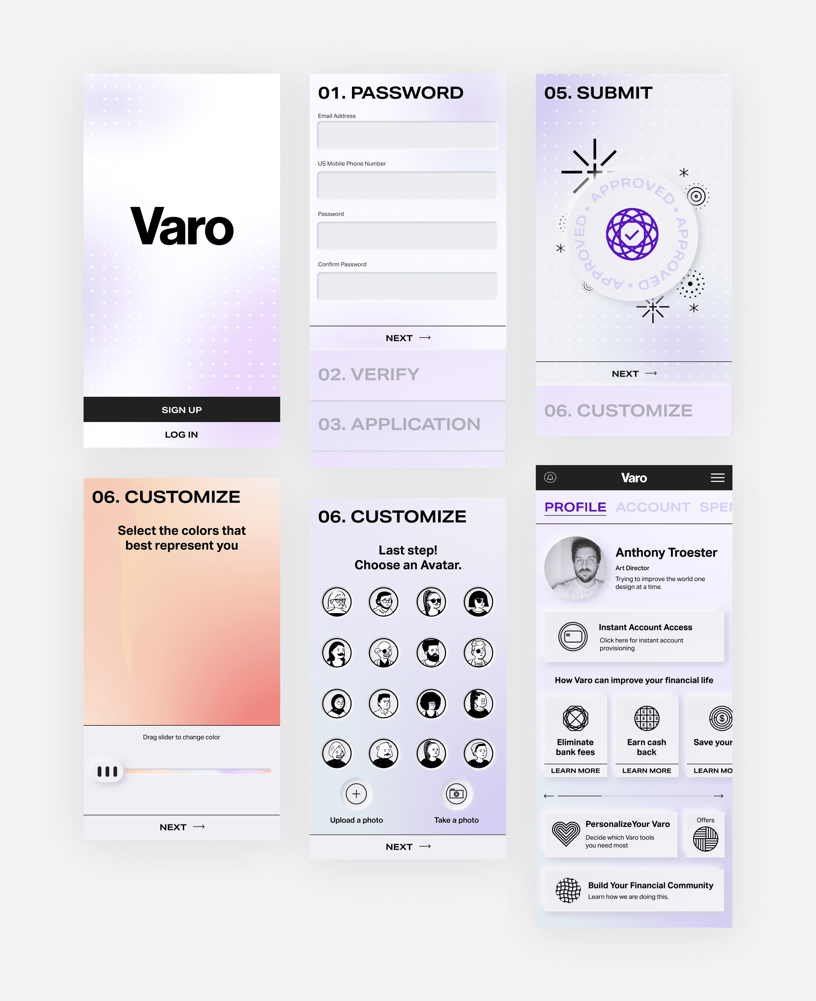
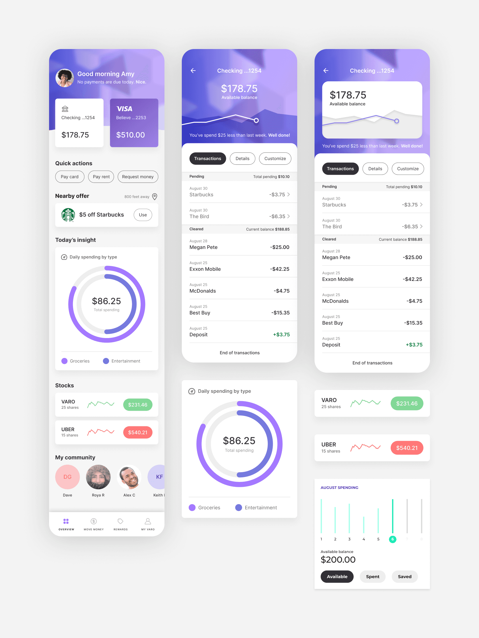
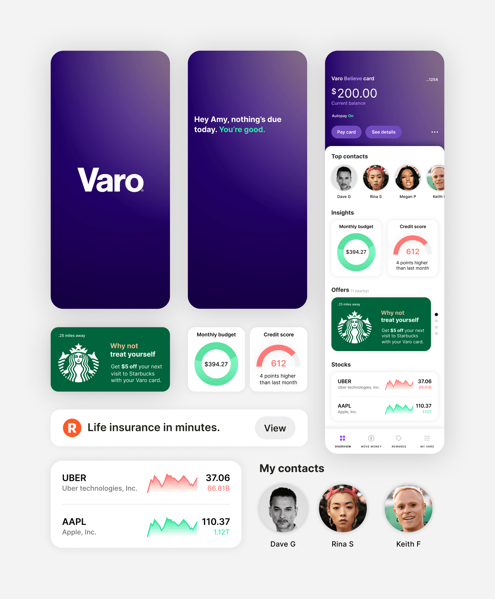
I recommended we focus on three screens — sign in, home screen, and account activity. They would serve as key touch points in a customer journey — what they see at the 'front door', what they see on their core home screen, and what they see when reviewing transactional details.
Explorations
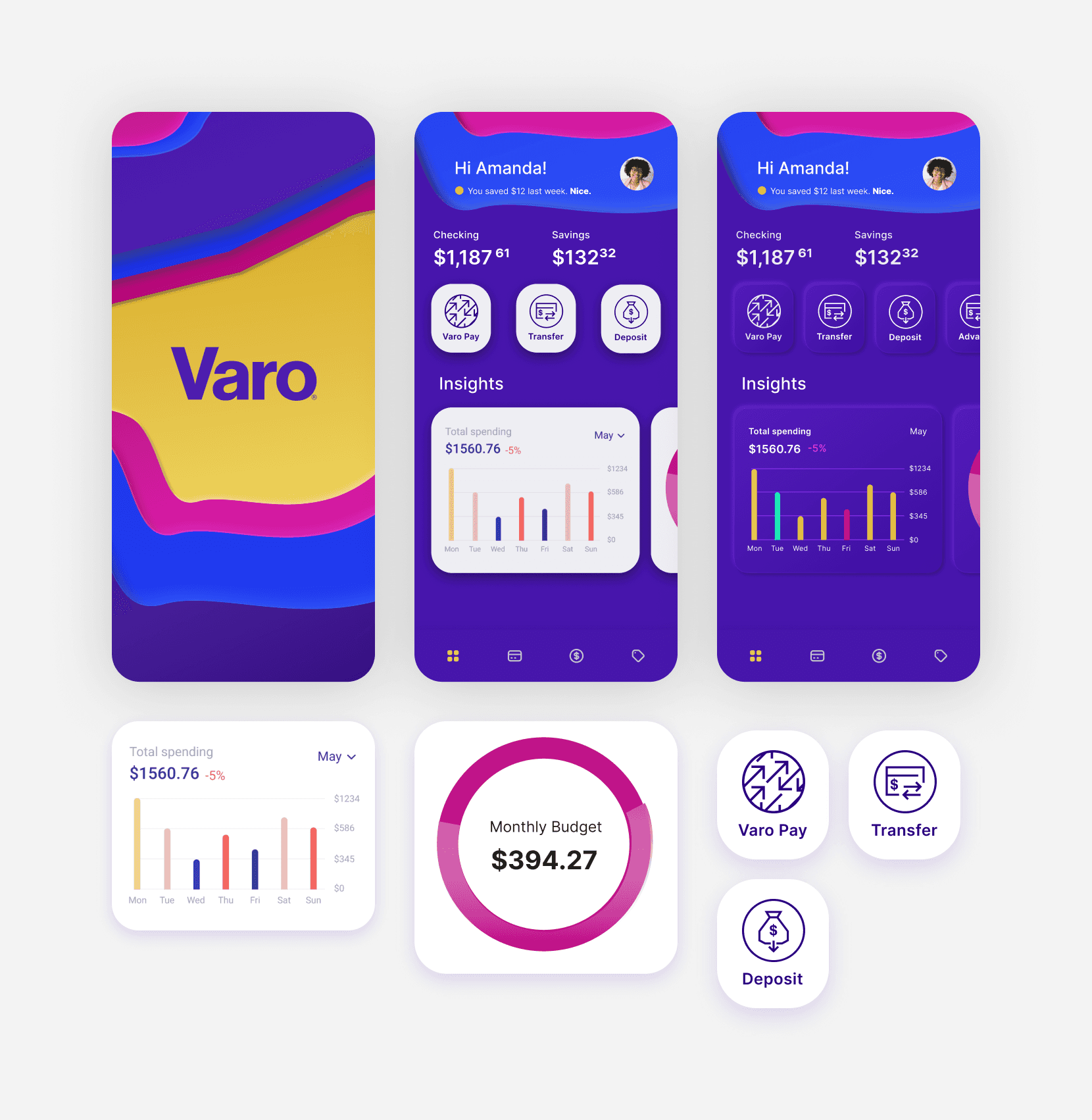
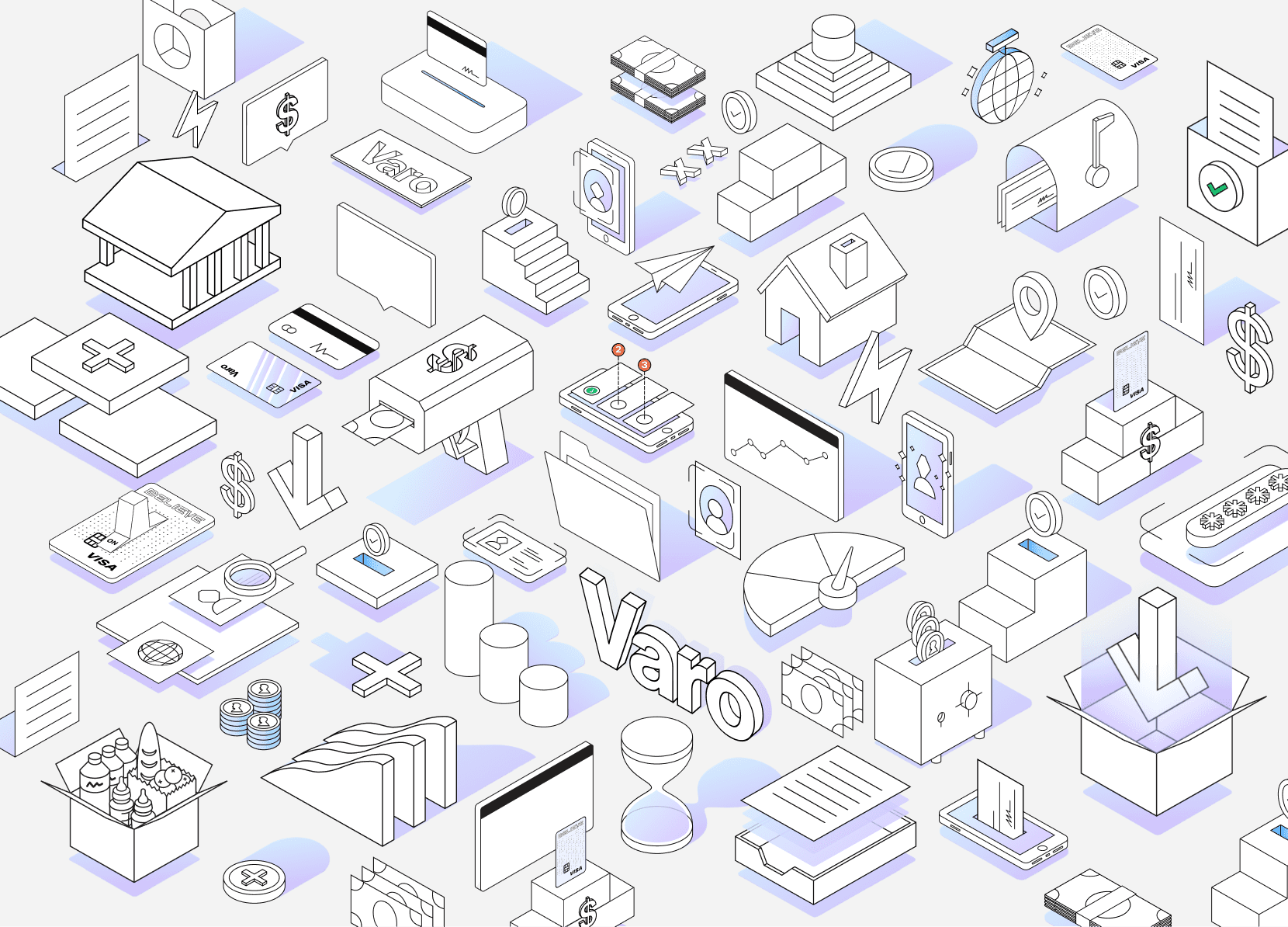
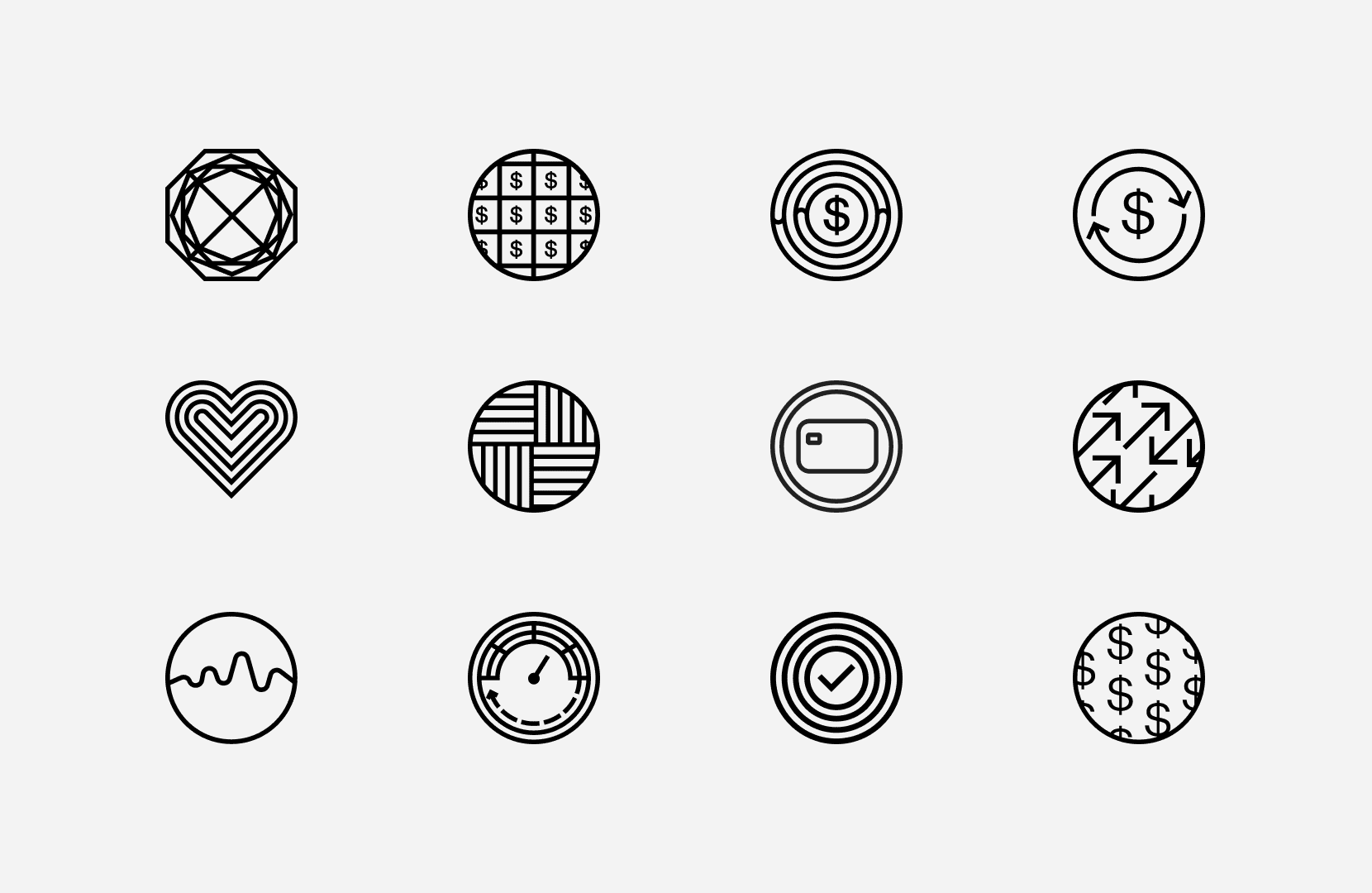
Marketing team
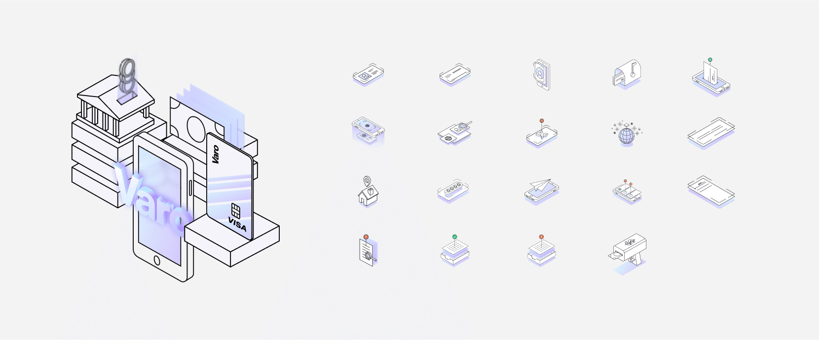
Illustration and iconography
In addition to my involvement with the product design team explorations, I assisted leading the art direction of the illustrative style that would compliment our redesign effort.
Samples: These are a sample of the explorations created by the Varo marketing team.
Synthesizing
With a variety of explorations around design, iconography, and illustrations, we began sprinting to create a cohesive experience that brought together both teams approaches.
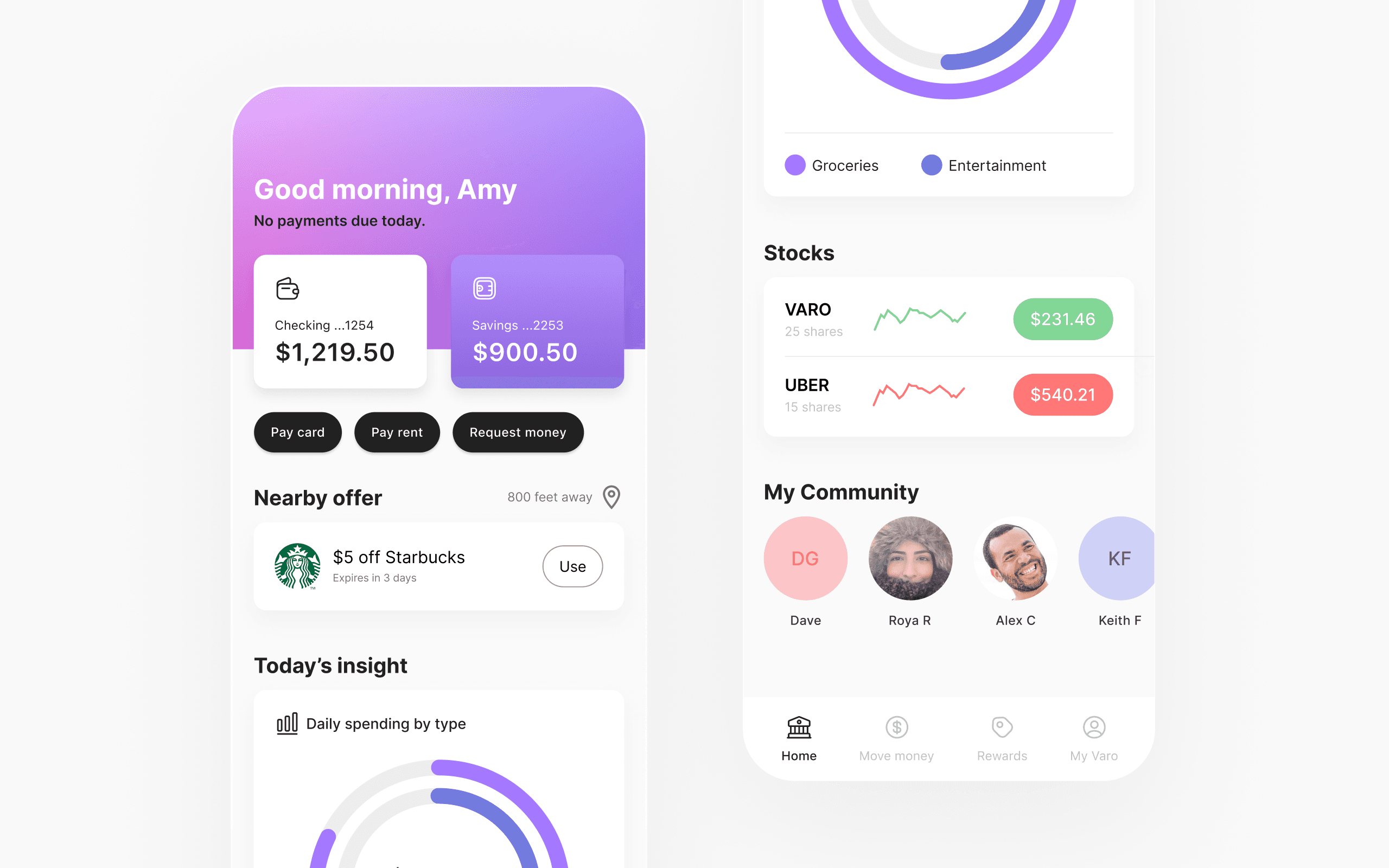
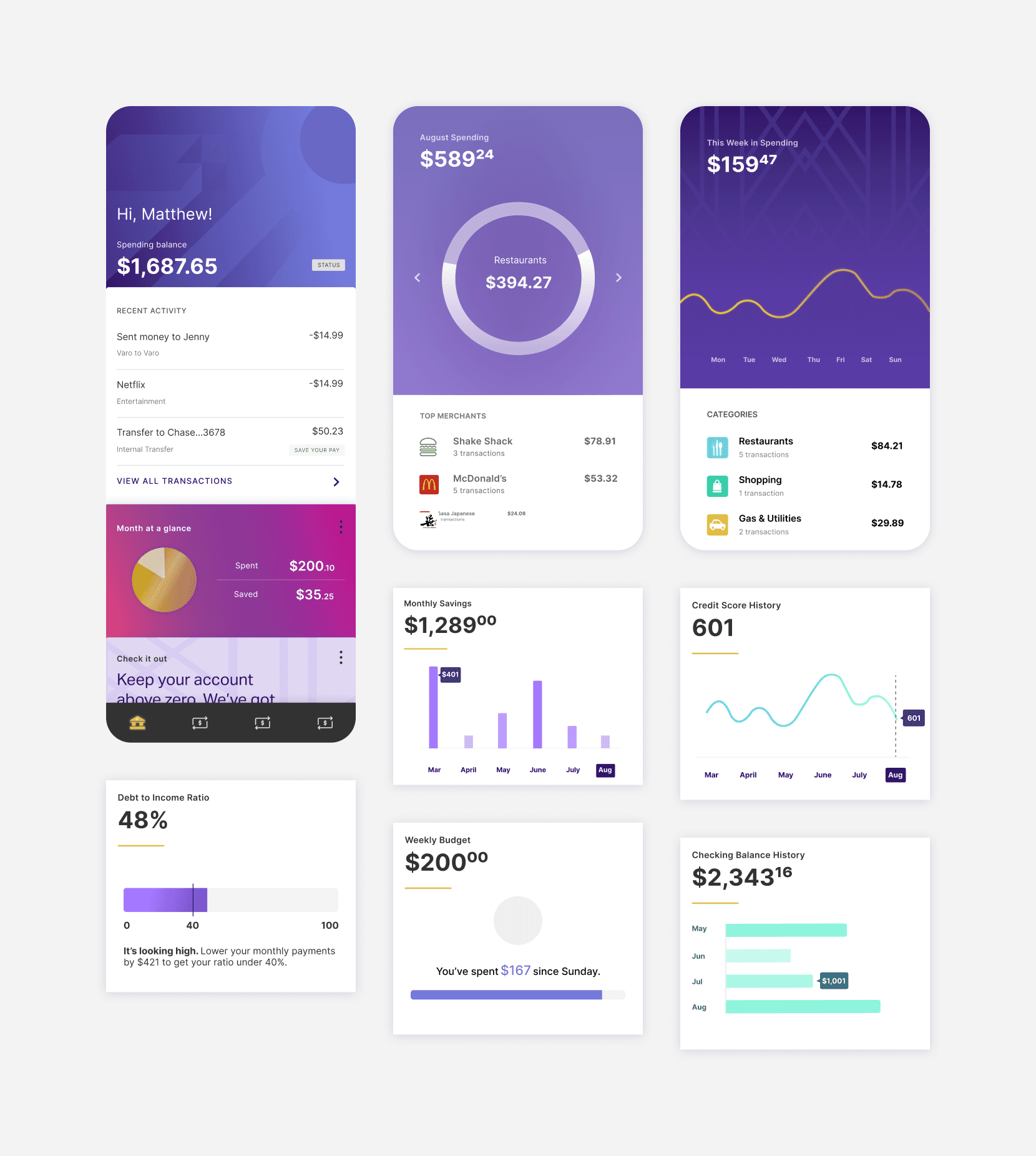
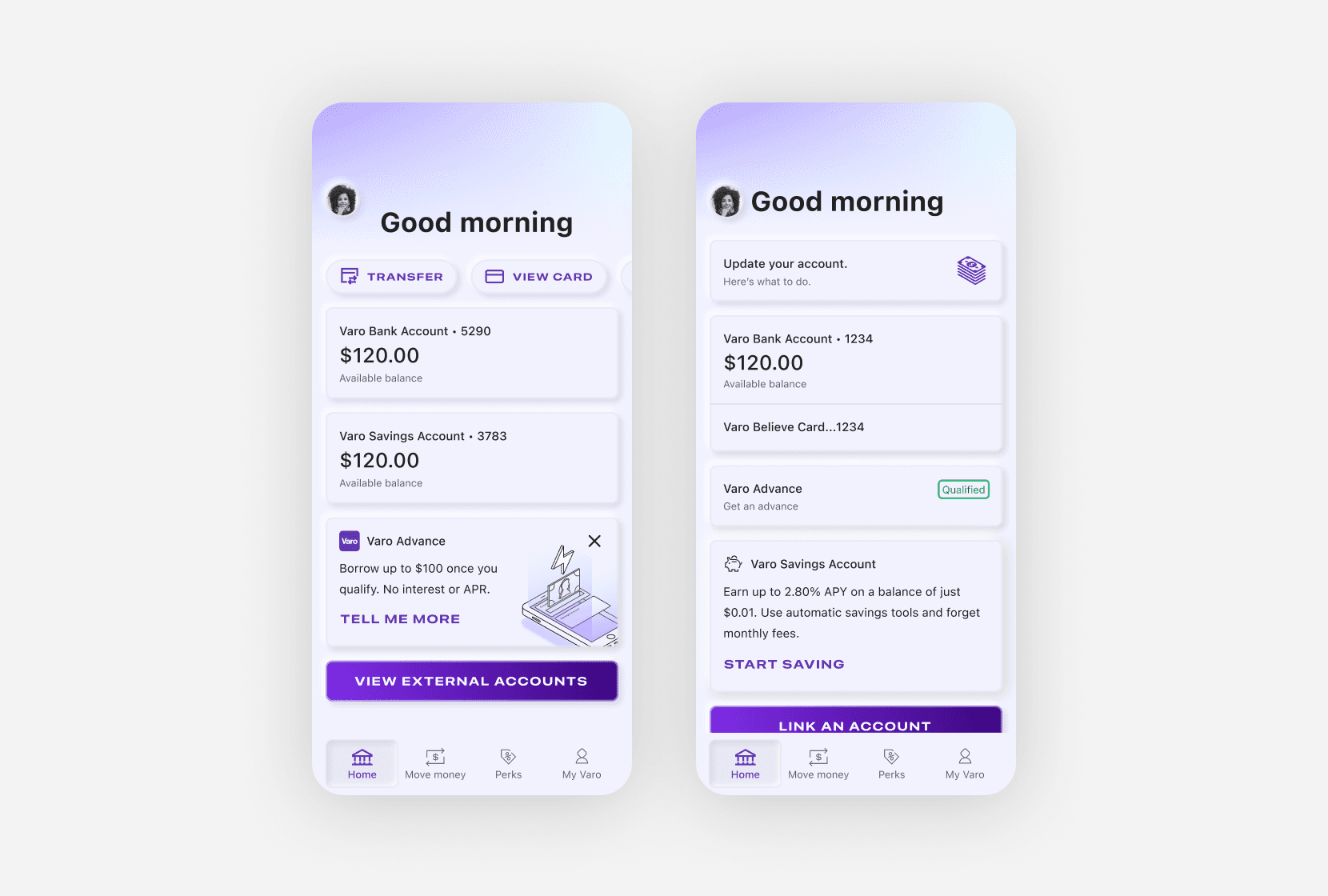
Insights and account tiles
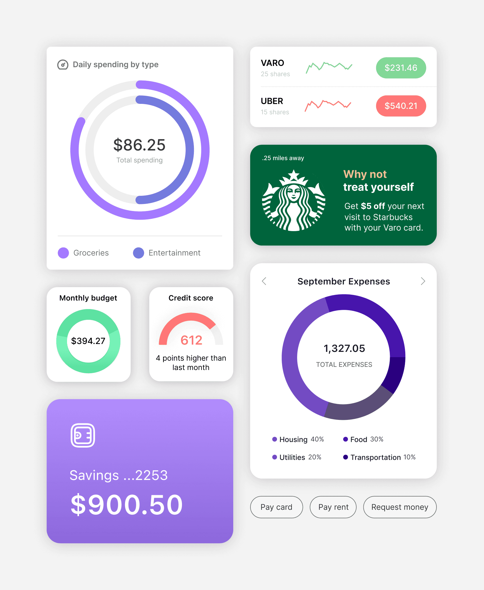
The initial proposals from product design for insight tiles.
After synthesis
Sign in
Before synthesizing the product team designs with the market team's approach.
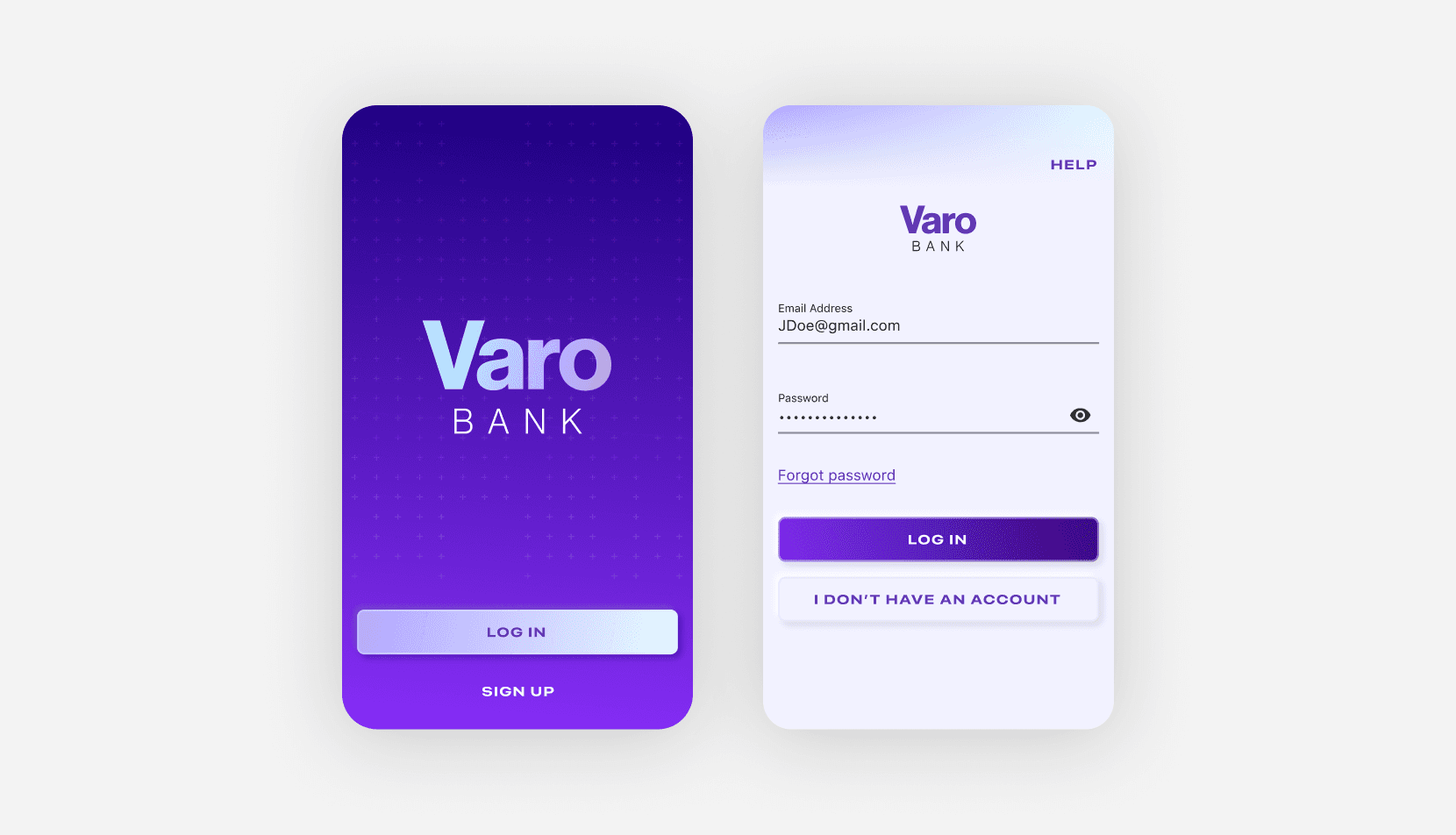
After synthesis
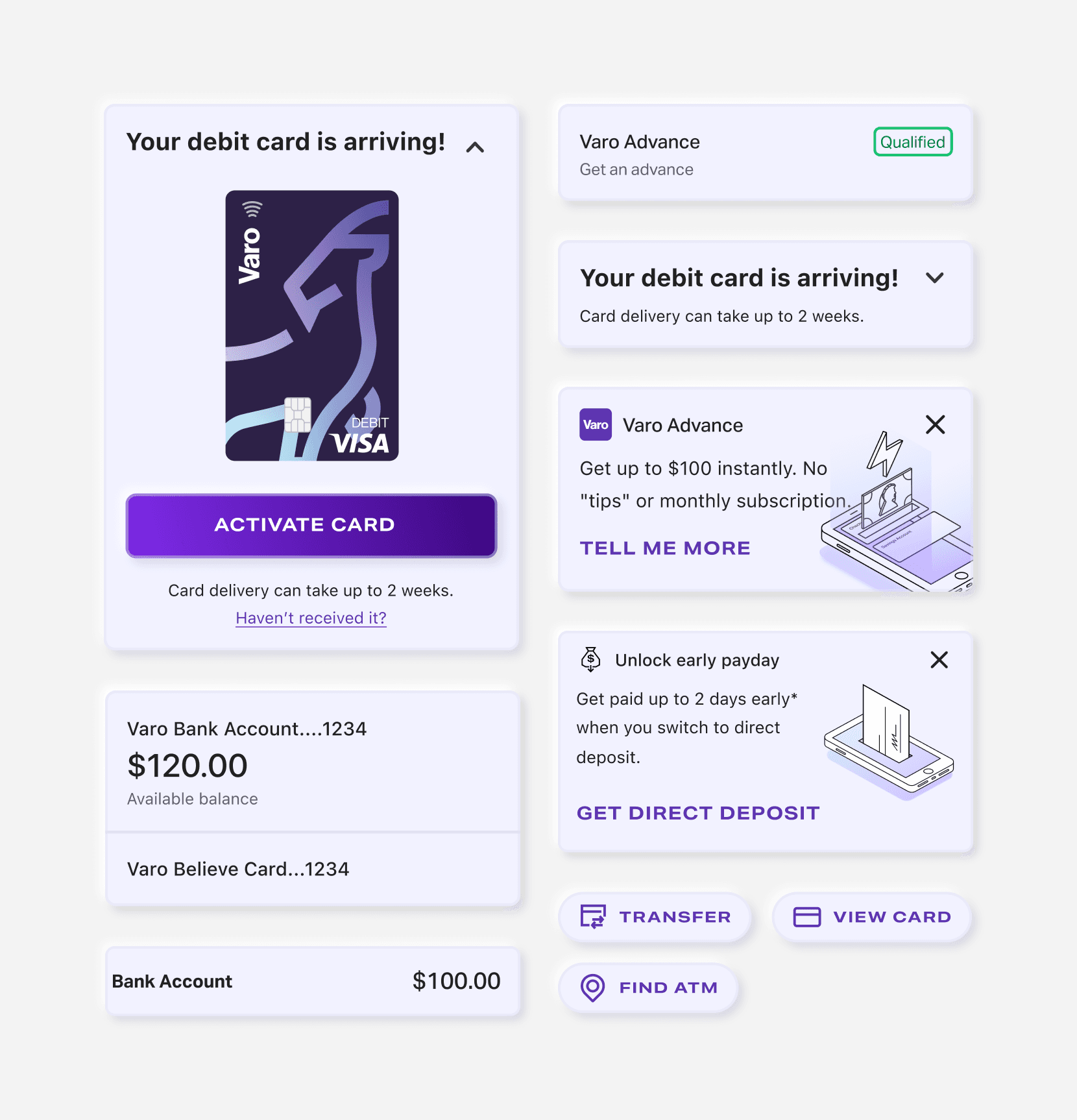
Accounts
Before synthesizing the product team designs with the market team's approach.
After synthesis
Delivery and release
Our efforts culminated in an accelerated, successful delivery of a design language, system, as well as native and web experiences that reflected the vision of both design teams, and the brand values Varo stands for.
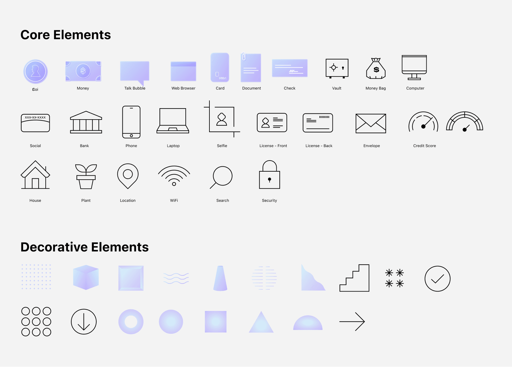
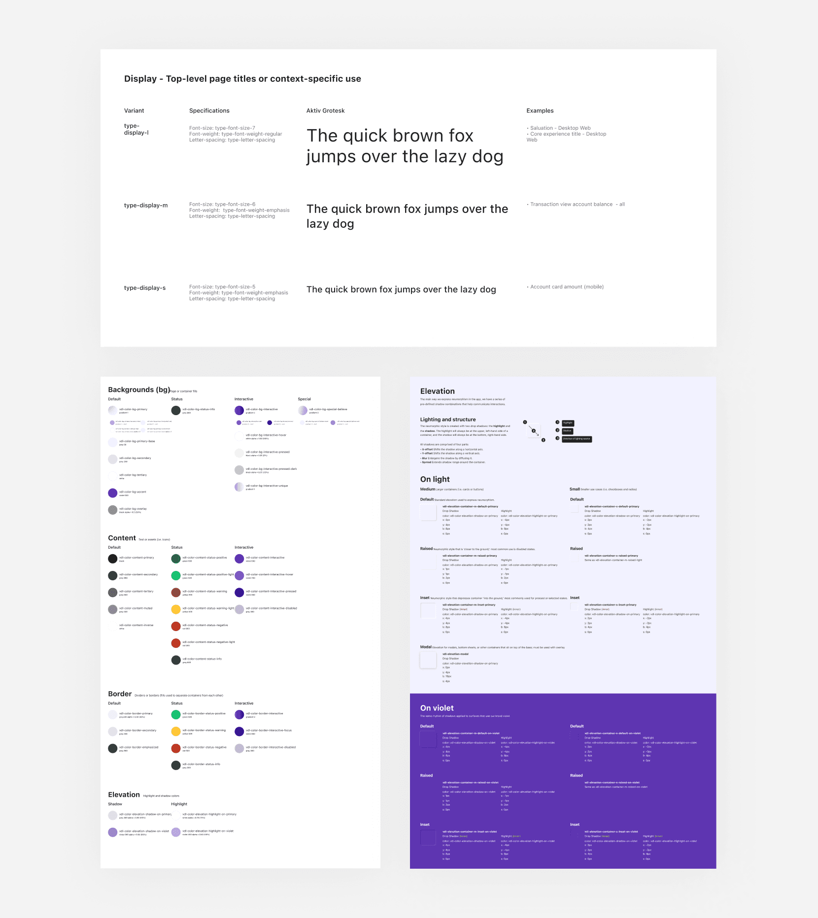
Style guidelines
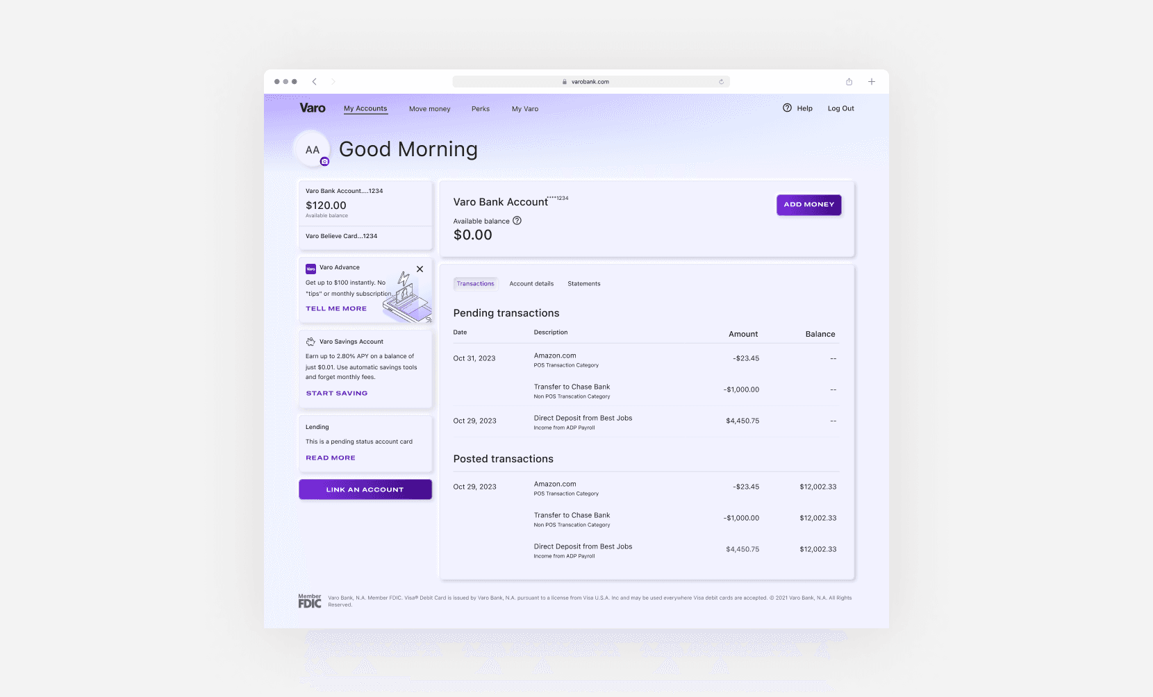
Our design team crafted comprehensive style guidelines — components, typography, color palettes, skewmorphic elevation, and proper usage are covered in depth.
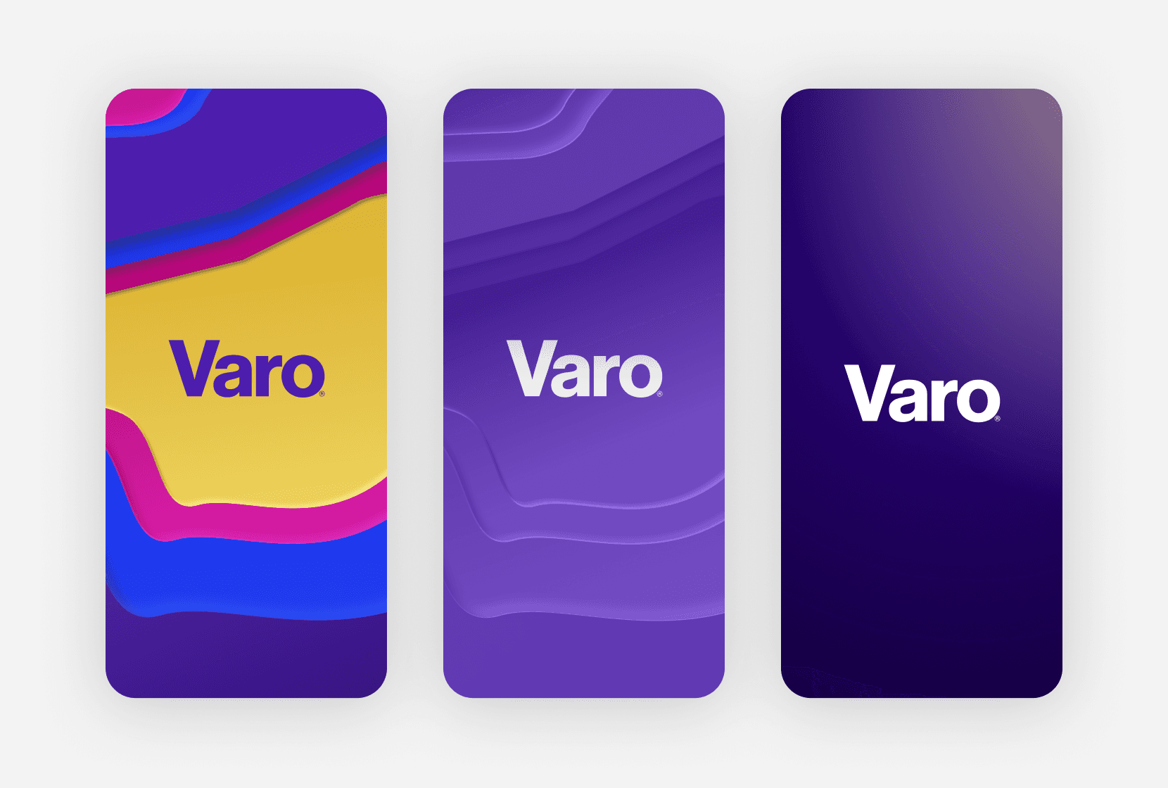
Illustrations
Native app
Our design team crafted comprehensive style guidelines — components, typography, color palettes, skewmorphic elevation, and proper usage are covered in depth.